Portable Powerhouse or Missed Opportunity?
Overview
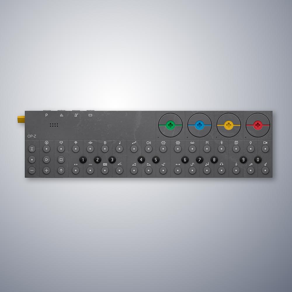
You’re looking at the OP-Z, one of the most powerful, portable electronic music instruments on the planet. This TV remote-sized device offers a wide range of features: sequencing onboard synthesizers and samplers, controlling other synths and modular gear, and even managing DJ lighting and motion graphics. However, its innovative design has elicited mixed reactions from the electronic music community, largely due to build quality issues and its unconventional user interface.
Design and Build Quality
The OP-Z’s design is both its strength and weakness. It is crafted from a lightweight composite material that is unfortunately prone to warping and bending. Those cute dials, which are attached magnetically, have a habit of popping out. Additionally, the thin yellow plastic used for the on/off/volume knob is fragile. Despite these issues, the device’s power and portability make it a must-have device for the electronic music producer. The OP-Z’s interface is unconventional. Unlike many electronic instruments, it lacks a traditional screen. You can connect the OP-Z to your phone via Bluetooth and use TE’s app for a more informed view of what’s going on. Many traditionalists do. Otherwise, you need to rely on the onscreen icons and a series of LEDs that light up to indicate status. Florian Pilz, the Austrian synthesist, one of YouTube’s great personalities declared in his year-end wrap-up of audio reviews that “The build sucks, the UI sucks and you definitely need a phone or tablet if you want to get the most out of it.”
But is this accurate? Does the UI suck or is this the reactionary whining of a culture that has grown to expect a screen on every device they touch?
The User Interface
I’m not going to lead you on an in-depth walkthrough of this device. They’re all over the internet. I come to music with a design perspective and I’m asking UX question, “is this interface well designed?” This is where you get into what’s most interesting about the OP-Z. It’s innovative. Because it’s innovative there’s a somewhat steep learning curve with all the opportunities and challenges that brings.

In my opinion the product is well designed; for what it does and for my user needs. There’s a reason the MoMA design store sells nine different Teenage Engineering devices. In daily practice, I can manage the basic workflow (create a multi-track beat) without ever referring to a manual or leveraging the app. The interactions do not take long to master. It’s the more advanced features that get tricky without a reference. That said, the UI is not completely intuitive. You must read the manual or watch online tutorials to learn how to use the device. Some of the interactions are like you’d find on other musical instruments and software, but some are unique. The biggest issue with the device is that several key interactions require button combinations the user must memorize. There’s no indication from the interface what they are, but once you learn two or three of these you can perform most of the basic skills required to make music.
- Controls and Indicators: The OP-Z has four main global buttons for project, mixer, tempo, and screen functions (1). It supports ten banks of 16 patterns each, which can be used to create and chain songs. The colorful dials on the right (2) are limitless encoders, which rotate to adjust various parameters, though their exact values are not always clear without a phone app.
- Button Functions: The top row buttons (1) serve global functions and can change based on the device’s mode. The lack of dynamic labeling on these buttons can be confusing, as their functions are not always intuitive.
- Track Types: The OP-Z supports eight concurrent tracks (3), with the first four dedicated to drum sounds (bass, snare, hi-hat, and sample) and the next four to synthesizer instruments (bass, melody, arpeggio, and chord). Additional buttons control effects, tape playback, performance modes, DJ lights, and video.
- Note Entry: The device features a mini piano keyboard (4) for note entry. Although not velocity-sensitive and criticized by some for being too small, it can be connected to a standard MIDI keyboard for enhanced playability.
The Design Evaluation
The OP-Z’s design is a study in innovation. It offers a minimalist interface with a learning curve that facilitates powerful music creation. While it may not be intuitive at first, experienced users can become proficient with the device. The lack of a screen was likely a deliberate design choice to keep costs down. And there’s an app for those who need it.
Smart Design Choices
- LED Indicators: The LEDs are used creatively to indicate status, with colors representing different modes and values. The primary purpose of the top row is for selecting the track type. But this indicates another issue with the OP-Z. The button labels are permanent and cannot update to indicate a different function in a different mode. Sometimes the LEDs provide some clue as to purpose, often they do not.
- Color-Coded Dials: In my opinion the colorful dials at the right of the device are genius. They are limitless encoders. They spin in both directions indicating increasing and decreasing values for various functions. In some situations, the tiny led to the bottom left of the dial indicates status, but these are relative, and you won’t get exact values without connecting to your phone. The color coding helps with recall. The dials affect the sound consistently across percussion tracks and synth tracks, depending on what “page” or combination of parameters you’re editing.
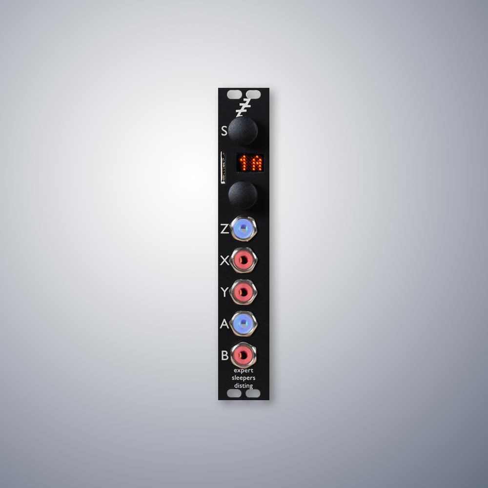
The OP-Z supports eight concurrent musical tracks, indicated by the first eight icons on the top row of buttons. The first four of these are drum tracks: bass, snare, hi hat and sample. They are all populated with good sounding samples that can be replaced with user samples. The next four are synthesized instruments: Bass, melody, arpeggio and chord. Each of these tracks loads synth engines that can be customized to some extent. The rest of these buttons are control tracks for unique features, controlling the effects, a fun tape playback mode that mangles the song, master track for transposing melody, a performance mode, a mode for accessing utility devices added to the back of the device, a mode for controlling DJ lights and a mode for controlling video via the Bluetooth screen. This device can do a lot and you’re going to need the manual to access some of these more advanced features. The bottom two rows represent a piano keyboard for entering notes. For example, black 3 is C#, 5 is D# and the button with the logarithm icon is E. This is a cool design pattern but it’s not unique to the OP-Z. The pattern is easily recognizable though the labels for alternate functions confuse things. With this much power, almost every button on the OP-Z is multi-purpose. The buttons are not velocity sensitive, and a lot of people online complain their fingers are too big for them. You can connect the OP-Z to a standard midi keyboard. The buttons at far left are for managing various functions. The I icon is a selector button that is often held in concert with other buttons for entering different modes. The left dot, triangle and square reference old tape-recording buttons, record, play and stop. Plus and minus are self-explanatory, and the arrow indicates a shift. Finally, the icons atop the bottom row of buttons indicate all sorts of special functions for altering note playback behavior. These provide some exciting tools for composition but are mostly difficult to decipher with a manual. At this point the OP-Z probably seems overwhelming, especially to people unfamiliar with instruments of this nature. So how can I claim the interface is well designed? I look at it this way. The basic functions are well indicated and easy to learn. The advanced features require a reference, even for seasoned players. But you can make music with it using the basic features.
For someone who wants to pull this out on a bus or plane and noodle around for an hour or two it is possible to create some interesting sounding patterns without ever referencing the guide.
I have created an entire sequence of songs on a single flight. To do this without a screen, which would significantly influence price and portability is, in my opinion, a success.
User Workarounds
Despite its innovations, some users find the OP-Z’s design challenging. Users have proposed solutions include a sturdier version with a screen and third-party knobs. However, these modifications often detract from the device’s original design and can compromise its aesthetic appeal.

Third parties sell knobs that can be attached to the dials. People see a synth and they want knobs. In my opinion this doesn’t make any sense at all. The dials work well and can be spun multiple cycles with a single finger. Turning a knob requires resetting your wrist every 270 degrees or so. This is reverse engineering a really good design choice.
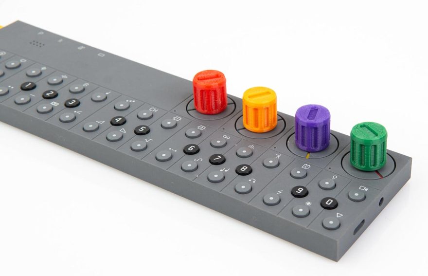
Most egregious, some users apply horribly ugly decals to their device with tiny notes on the various functions. It’s like applying a cheesy wrap to a Porsche 911. Almost nothing is gained, and the aesthetic is ruined. People are welcome to do what they like with their tools but it’s sad to see the extent to which people will go to de-innovate their device.

Heuristic Review
Applying Nielsen Norman’s usability heuristics to the OP-Z:
- Visibility of System Status: The device uses LEDs to indicate status, though not always intuitively. The little LEDs next to the dials glow more strongly as values increase. They change color to indicate different modes. The LEDs in the row buttons indicate active steps. There’s a lot of information without a screen.
- Match Between System and Real World: Some icons are recognizable, but many are not, making them difficult to decipher without memorization.
- User Control and Freedom: Users can navigate modes easily but risk losing changes if not saved. There are situations where pressing the wrong combination of keys can delete a pattern, or even an entire program.
- Consistency and Standards: While interactions are generally consistent, permanent labels can be misleading and can lead to situations where a button performs an unexpected action if the user is not in the mode they thought they were in.
- Error Prevention: There is limited error prevention; actions can be destructive if not careful.
- Recognition Rather Than Recall: The device’s logic becomes second nature, but users need to remember many details.
- Flexibility and Efficiency of Use: The lack of shortcuts means many functions require memorizing key combinations.
- Aesthetic and Minimalist Design: Yes, the device form is minimalist. Many would argue too minimalist. But there is also a ton of functionality, some of which users probably never access.
- Help Users Recognize, Diagnose, and Recover from Errors: Error recovery is difficult; there’s no undo function. Destructive actions take a few seconds to instantiate, a row of LEDs slowly activates as you hold the delete button combo, indicating something big is about to happen. But once’s the row is full the action has been irretrievably applied. That animation still inspires dread after years of ownership.
- Help and Documentation: Comprehensive online guides and tutorials are available, though in-device help is lacking.
Here’s an assessment of the complexity of some basic functions:
Summary
The Teenage Engineering OP-Z is a great tool for musical hobbyists and serious performers. It’s a Swiss Army Knife of capabilities that can act as the main device or a support device in a performers musical kit. It’s incredibly portable. I have taken it to seven or eight different countries to make music. The battery lasts about 6 hours which is plenty for a long flight, train ride or day by the pool. The sequencer is powerful and easy to use at its most basic but much more complicated at its most robust. The sound engines however are limited. It’s hard to do real sound design on this device. However, for someone who likes to make music and likes to have a music making device easily accessible, the OP-Z is a great device. While the complaints about build quality are legitimate, the complaints about the UI and lack of a screen seem more about resistance to accepting the device on its own terms than true limitations or bad design decisions. Our world is covered in screens. They’re often helpful but it’s actually nice to get away from a screen now and then. And the interface designers at TE did a really good job developing a user interface for this complex and inspiring tool.

