Cheskin UX Consulting and Information Design
Ethnographic Research, Design Methods and Deliverables
I spent several years as Senior Information Designer for Cheskin Added Value, an innovation consulting and research firm. Louis Cheskin was one of the founders of market research, consistently proving it’s value to business. He used scientific methods to inform marketing. He was responsible for changing margarine from white to yellow, influenced the launch of the Ford Mustang, and helped create the Gerber Baby among other accomplishments.
At Cheskin I was privileged to consult with and deliver results for organizations like The Gap, Church & Dwight, Microsoft, Nike, Intel, Kimberly Clark and other loved brands.
My core responsibility was to act as videographer on ethnographic customer interviews, help synthesize the resulting data and apply visualization techniques to bring key findings to life. This ran the gamut from information graphics that clarified complex concepts, to bringing personas and segments to life in print and video. I created entire DVD video presentations of research reports for Nike and Melvyn’s. I also helped to create concept illustrations, developed design principles, created stimulus for research and other myriad tasks.
Much of my work at Cheskin was with high-profile fortune 500 clients and is protected by NDA. Examples in this section are fictional (scrubbed), meant to indicate the type of work I participated in.
Accomplishments
Many of Cheskin’s clients were looking for traditional market research reports. In order to participate in ethnographic field research I acted as videographer, capturing 90-120 min interviews of real customers so the researchers could go review and synthesize their findings. I them worked with them to create a variety of design deliverables to support the research reports. These included information graphics, design principles concepts and recommendations, video reports, persona visualization and more.
- Pioneered the Market-Research Portal deliverable, a website built upon an organization’s customer segmentation, housing related research materials. Designed and produced two such sites for Kimberly-Clark, one for Intel and one for Microsoft.
- Developed company guidelines for design engagement deliverables: design principles, web development initiatives, video-reports, research-based concept development.
- Delivered UX heuristic evaluations and recommendations, information visualization.
MY ROLE ON THESE PROJECTS
- All of the designs in this section are my work.
- I worked with many research leads at Cheskin on the framing of these design problems. I joined them in field or they shared their findings after the fact if that was not possible.
- All the models, recommendations and segmentation and market research sites below were my work though much of the information is scrubbed.
DELIVERABLES
- Market research report infographics and models
- Heuristic reviews and recommendations
- Design principles and concepts
- Video personas, persona cards and posters, complete video reports
- Complete segmentation sites
- Complete market research web sites
Scrubbed examples of the design deliverables I provided
Every project I worked on was unique. The process and deliverables were customized to meet the needs of the client. I helped the researchers to define their project process, supported pitches and project managed all the digital design work.
I acted as an entrepreneur within the organization, building out a palette of offerings with descriptions of the value they provided to the customer, the time and effort they took to produce and the cost.
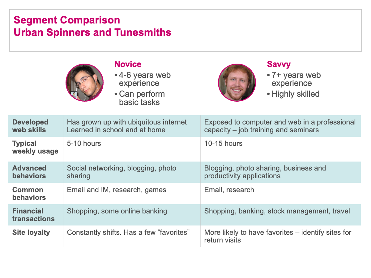
Information visualization: Segment model comparison
Cheskin designers worked closely with researchers throughout the research and report process, often contributing to the report content. Once the researchers identified concepts that they believed could benefit from a visual expression, we’d collaborate on the visualizations. These were generally expressed in PowerPoint as information graphics.
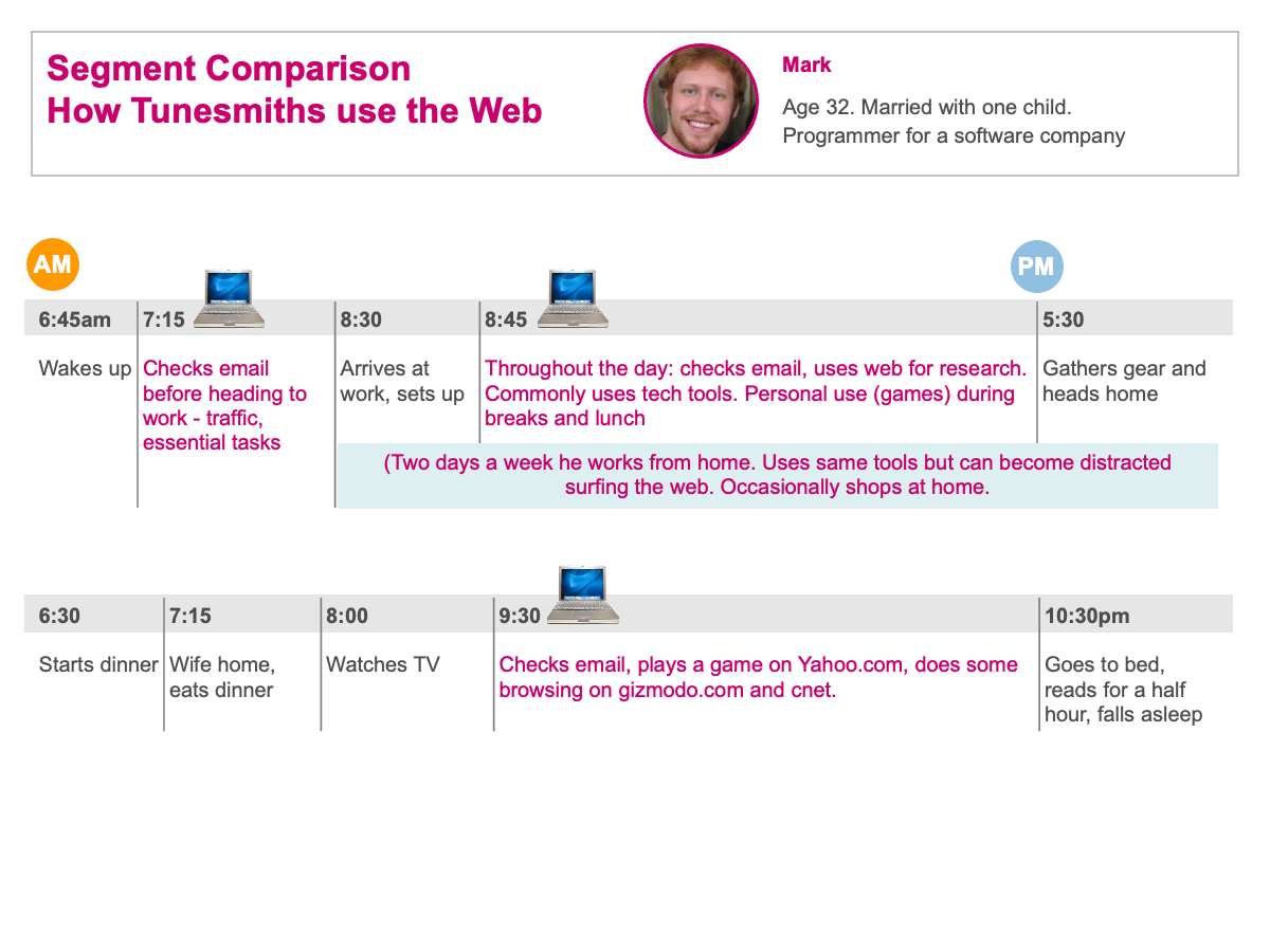
Information visualization: Segment scenario
The purpose of the information graphics was to express complex relationships in a simple visual manner. In this case we indicate the daily computer usage of a client’s music file consumer segment.
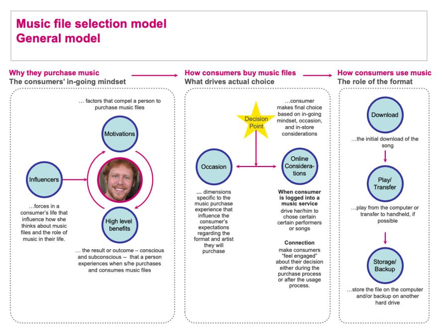
Information visualization: Modeling examples
The models we developed were always custom to the project. Different client employees have different learning styles, so expressing concepts visually enhances the likelihood they’ll be understood and the information will be put into practice.
General model for how Music Enthusiasts select music
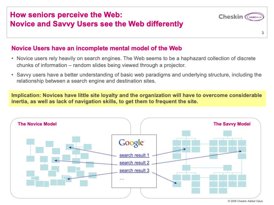
Information graphic model indicating how different seniors conceptualize web search
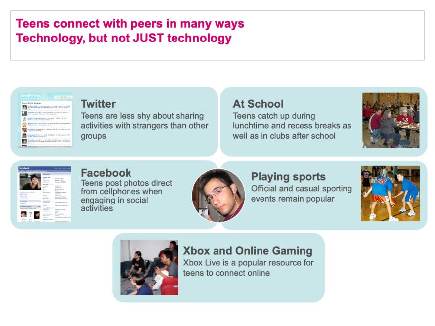
Information graphic for a report on teens’ social behavior
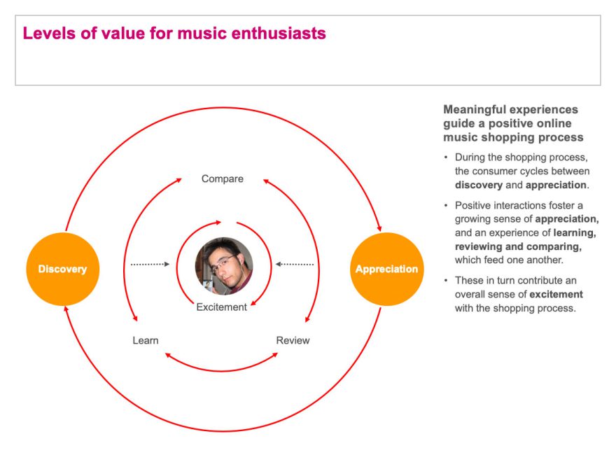
Levels of Value for Music Enthusiasts
Information graphic model indicating how music enthusiasts experience music
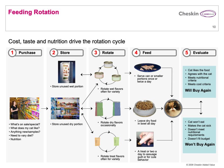
Cat Fanciers Food Rotation Model
Information graphic indicating the process by which a segment of cat lovers experience food products for their pets.
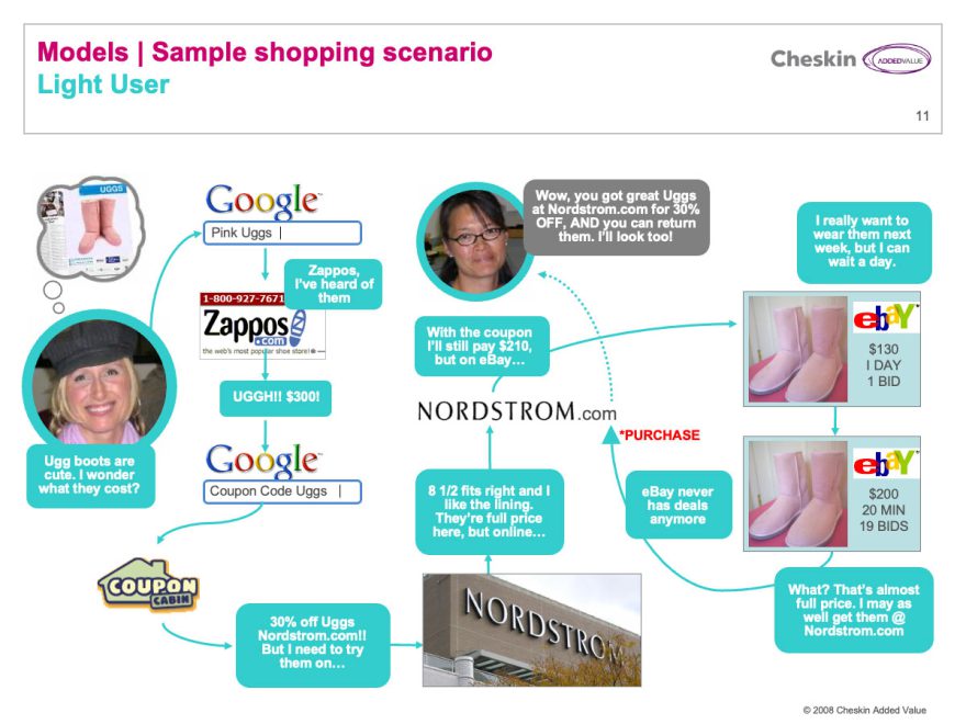
Journey map scenario indicating how Light users experience shopping online
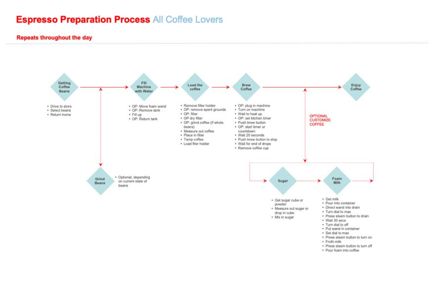
Information visualization: Process maps
Many client questions involved products with complex usage processes that required very careful evaluation. We observed consumers engaged in tasks which we then broke down into detailed maps of all the micro-tasks and potential process variations involved.
By breaking the process down we were able to analyze it and look for areas of opportunity or gaps that could be addressed with enhancements to existing products or new offerings.
Information visualization: Web consulting
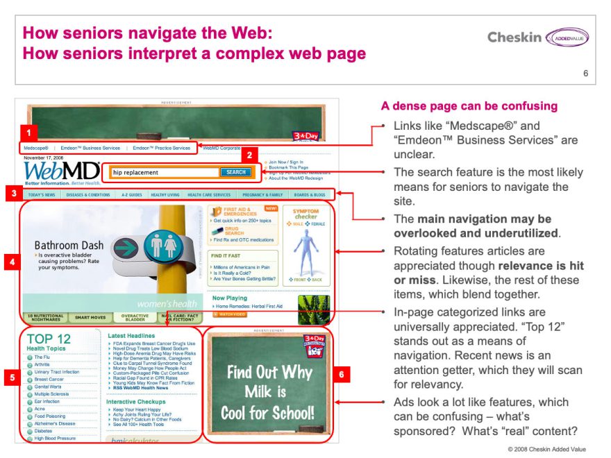
Due to my background as a web designer I participated in many web-related client projects at Cheskin. May of these involved informal user-testing. We combined insight based on interviews with user-observation to develop design principles for improving existing user experiences.
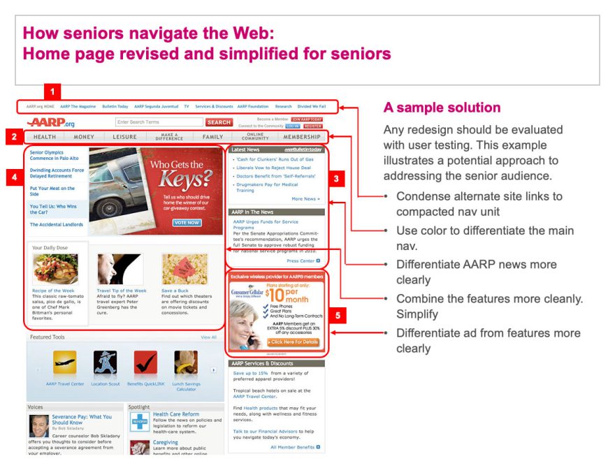
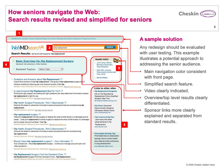
I would often illustrate these with sample recommendations of how a web site could be improved based on our findings.
How Seniors Interpret Complex Web Pages
Information graphic explaining how seniors experience complex web pages
Example Recommendations for Improving a Website Homepage for Seniors
Example Recommendations for Improving a Website Homepage for Seniors
Example Recommendations for Improving Website Search for Seniors
Example Recommendations for Improving Website Search for Seniors
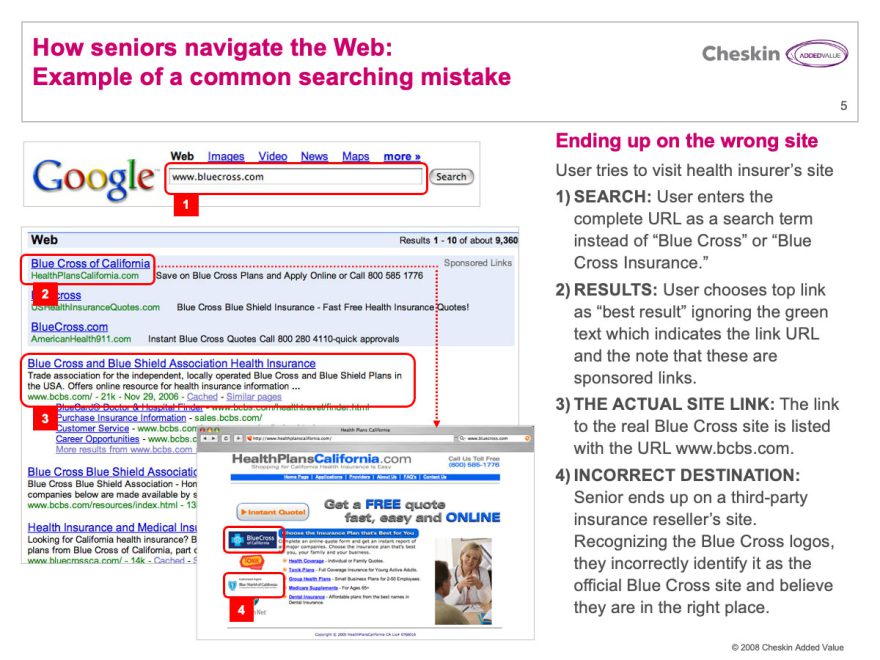
Web Seniors Searching Mistakes
Information graphic explaining how seniors experience web search
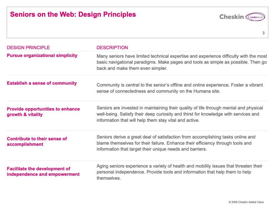
Design principles generated from a web consulting project
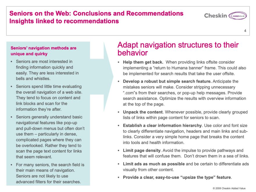
Recommendations for web experience improvements derived from research
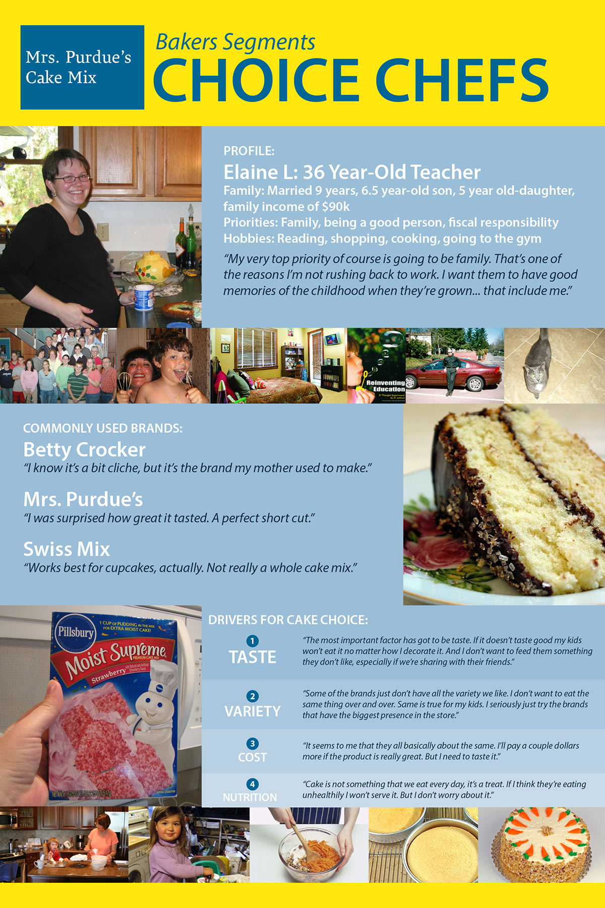
Persona Posters and Segment data cards
Many Cheskin research projects were built around the goal of bringing an important consumer segment to life so employees could better understand them and develop products and services suited to their needs. We often produced personas in print or video format.
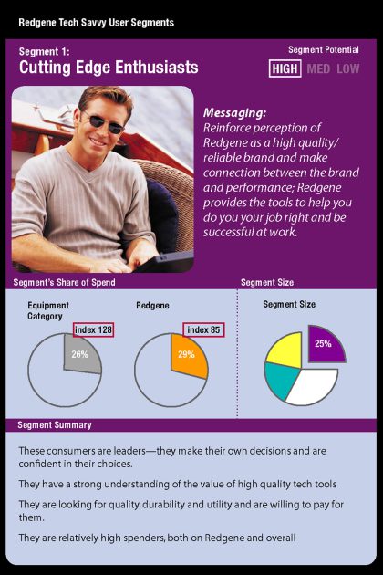
Personas are fictional, archetypal, representatives of a group of users distilled from research data. We interviewed members of a segment, determined what their shared qualitative characteristics were and developed a fictional consumer, representative of those characteristics. These were often expressed in poster or card format.
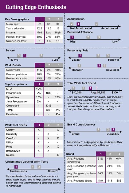
Segment cards were data-driven, quantitative expressions of research data.
Digital video segment stories
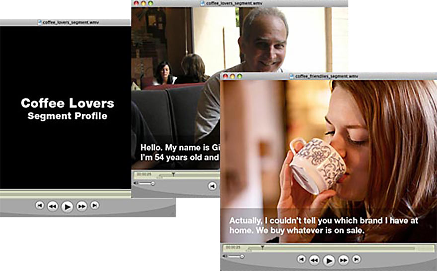
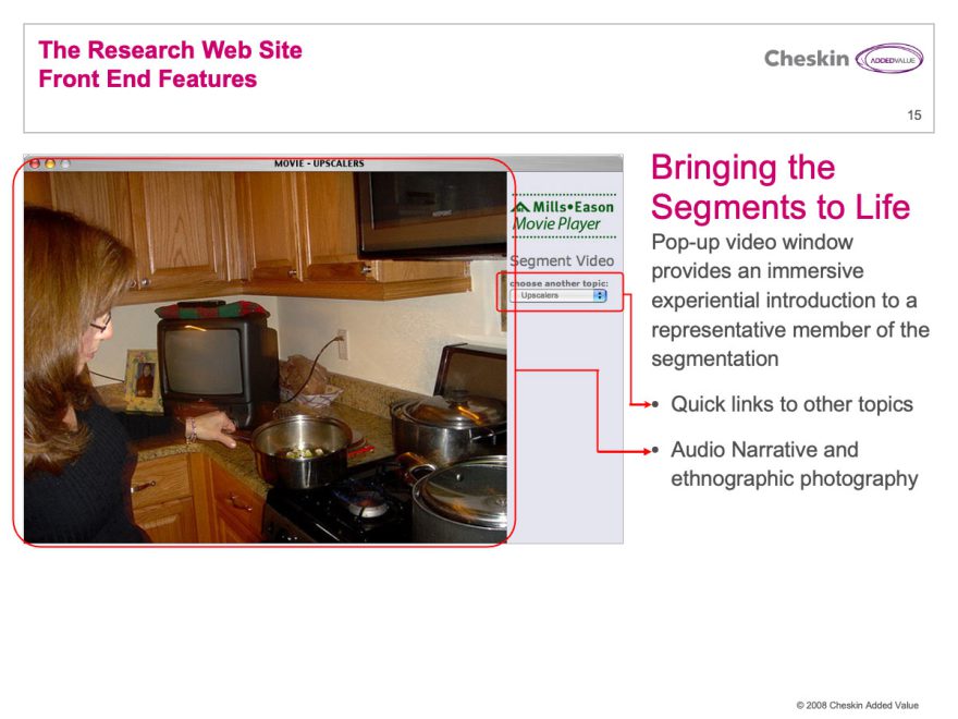
Video is a great storytelling device. Clients often need a compelling means of propogating a new segmentation across an organization. I helped develop many “digital stories” to bring segments to life.
These were short, fictional narrative pieces that expressed a pertinent consumer experience from the point of view of a particular segment. We used images collected in field, narration, music and simple transitions to convey these stories.
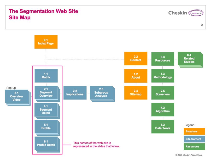
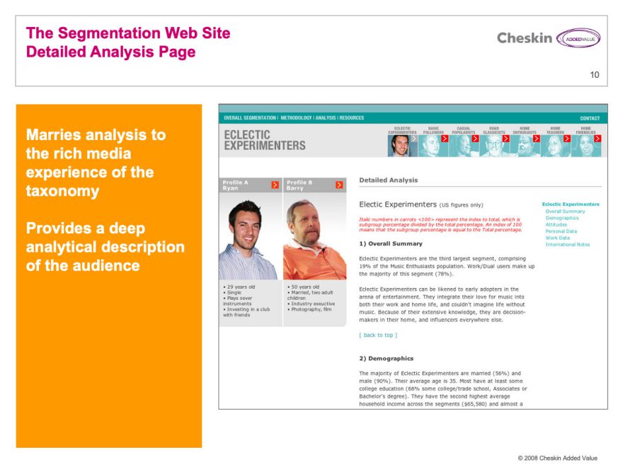
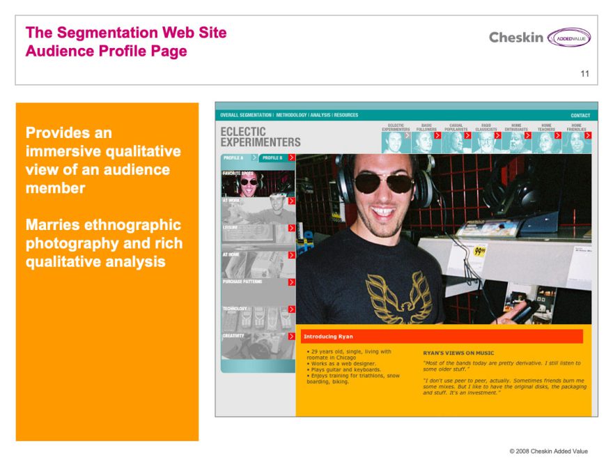
Segmentation web sites
In order for an organization to capitalize on the costly research involved in developing a segmentation it is essential to propogate the learnings and strategy developed from research across a company.
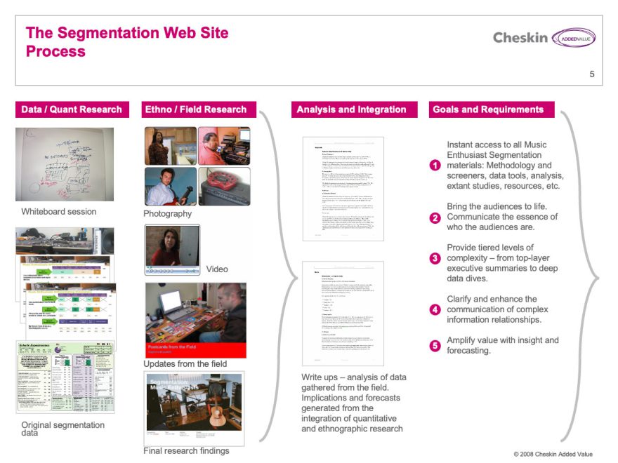
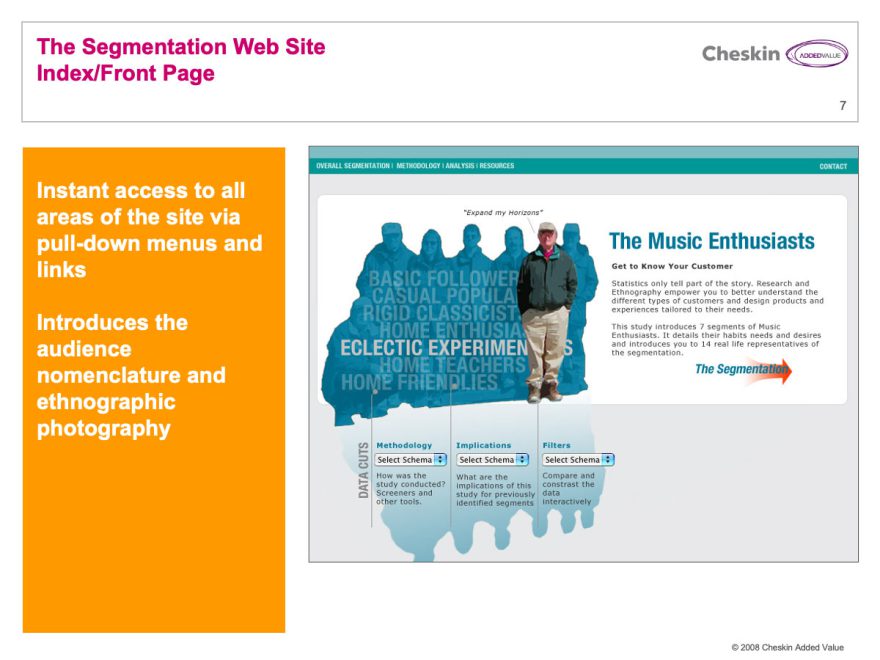
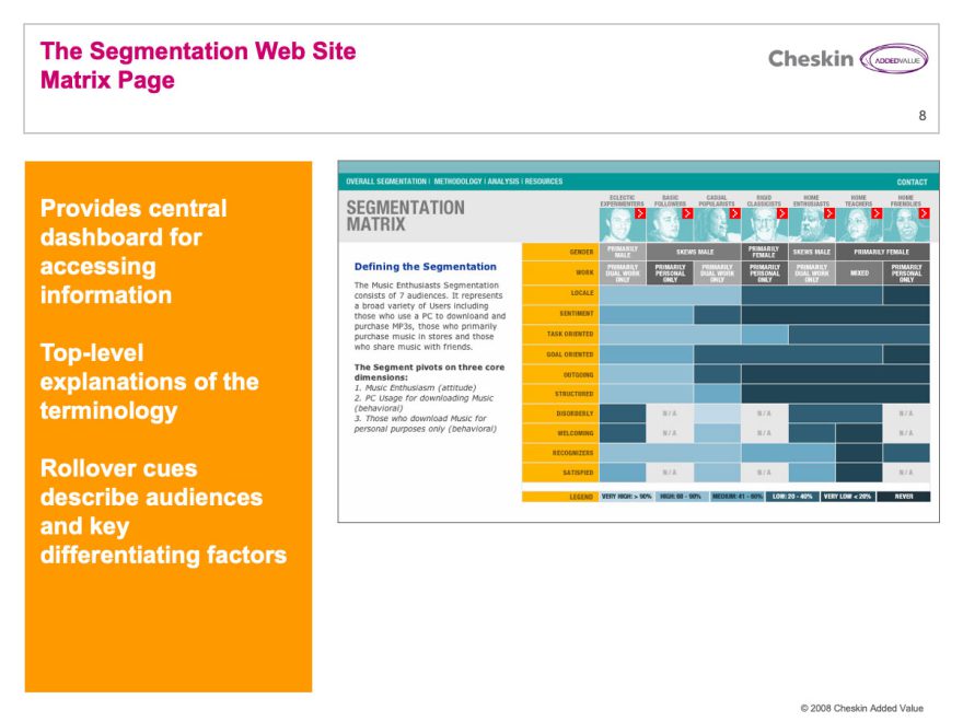
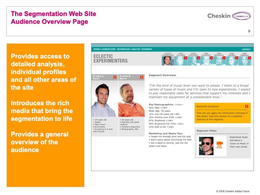
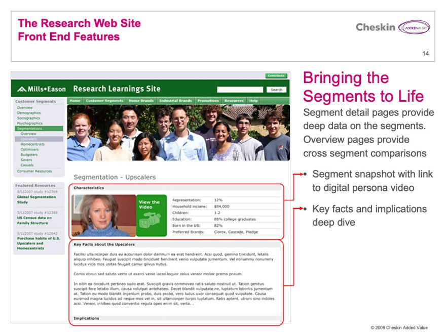
Segmentation websites are brochure-style, simple websites designed to provide the user with a rich-media experience of individual segments. I developed sites that provided an overview of the segmentation and a deep experience of representative consumers. These were enriched with a wealth of photography and video gathered in field.
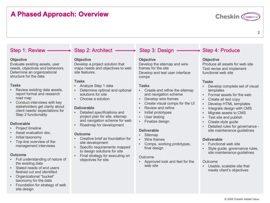
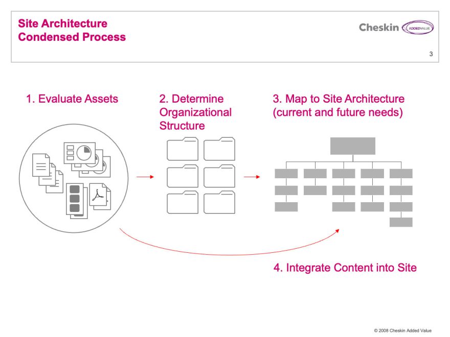
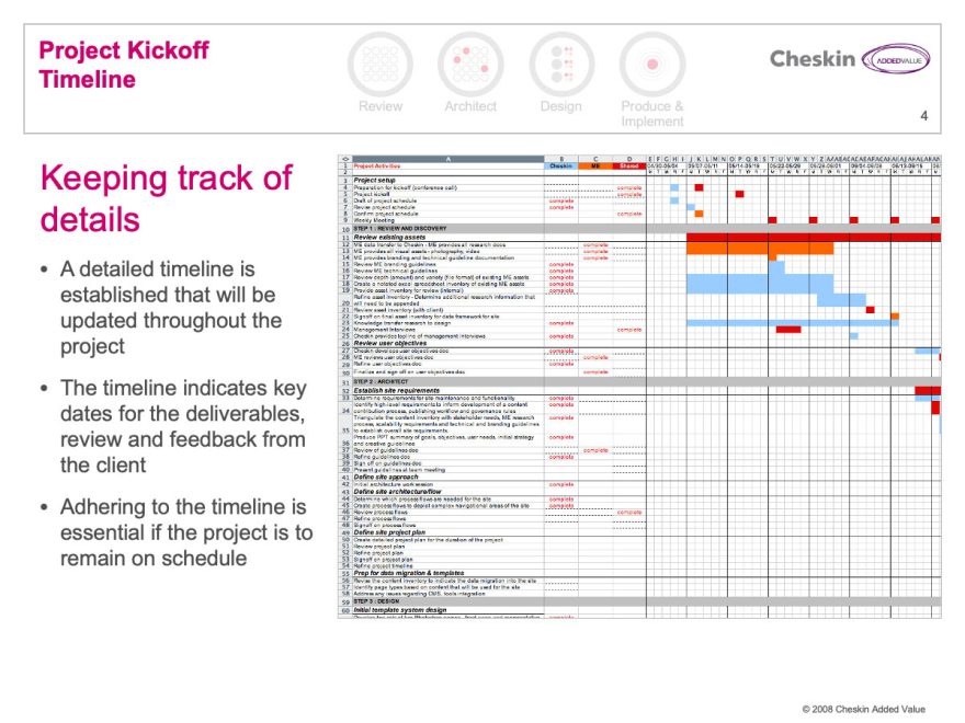
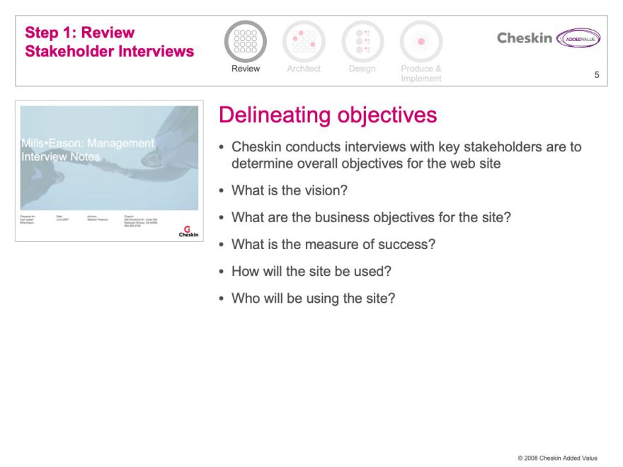
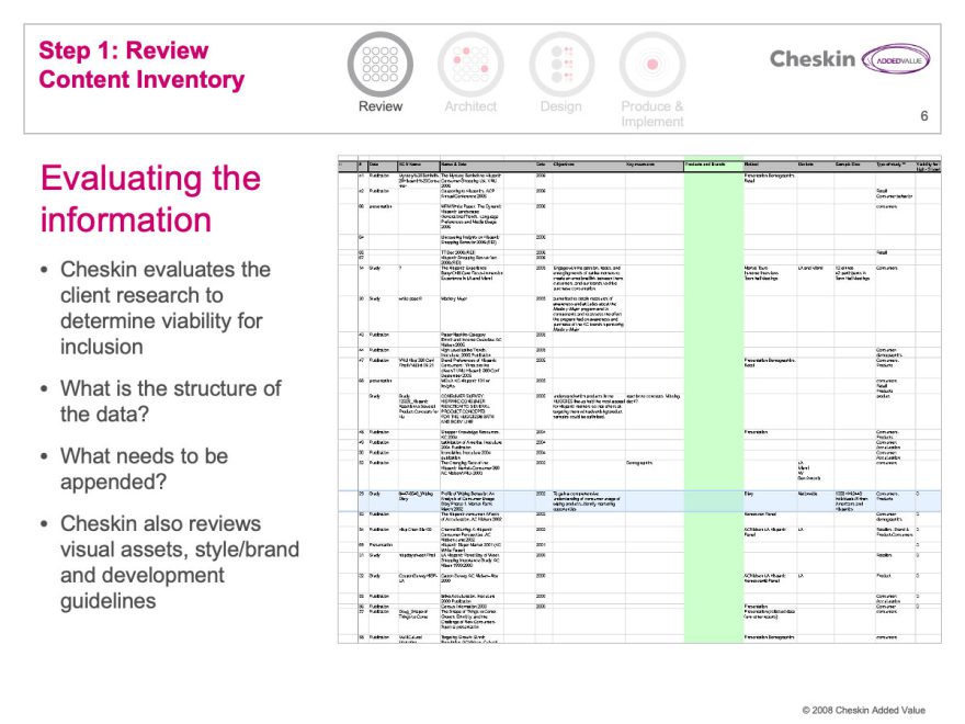
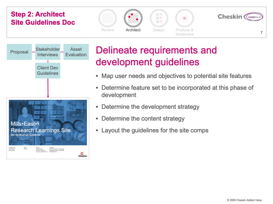
I personally led and executed these projects. These scrubbed slides are part of a guide I created explaining the process required to create the sites, the time-frame, effort and costs to add them on to a project.
Market Research web sites
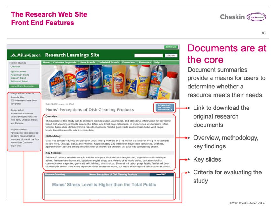
Many Cheskin clients invested a great deal of financial resources in market research. These reports were often delivered in lengthy PowerPoint and PDF files. Few companies have any efficient process for delivering these documents and their associated learnings and strategy across an organization.
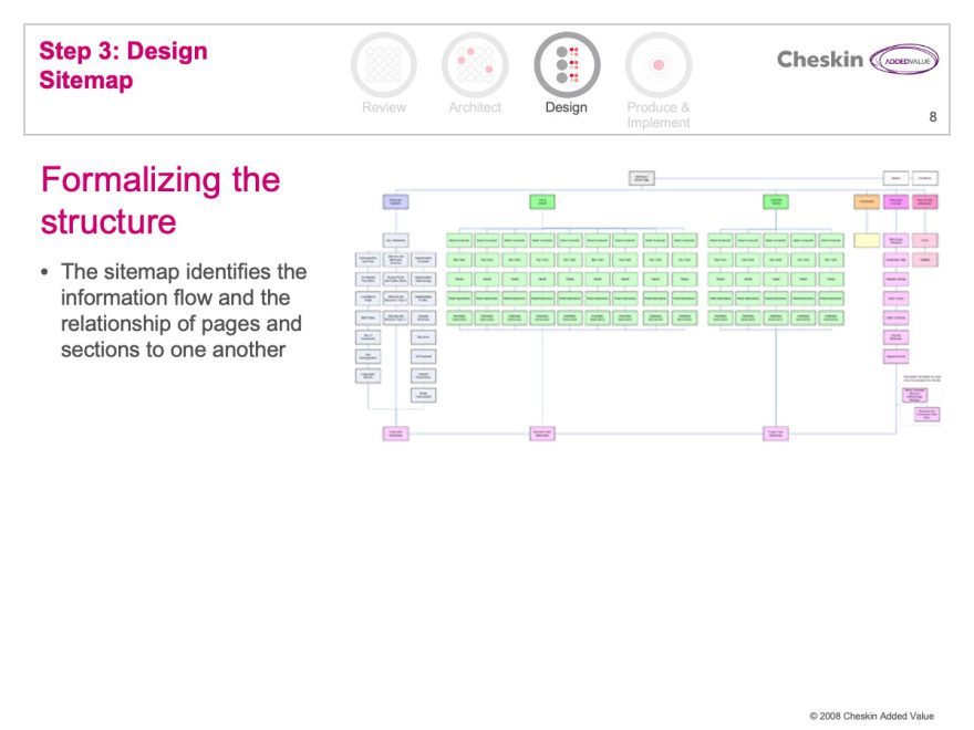
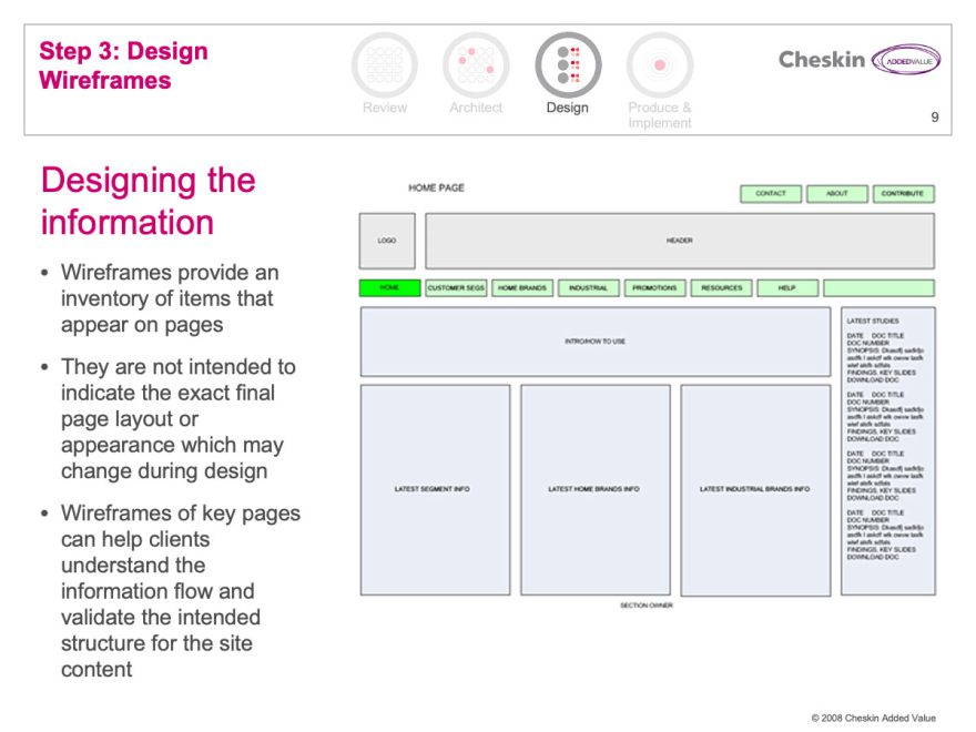
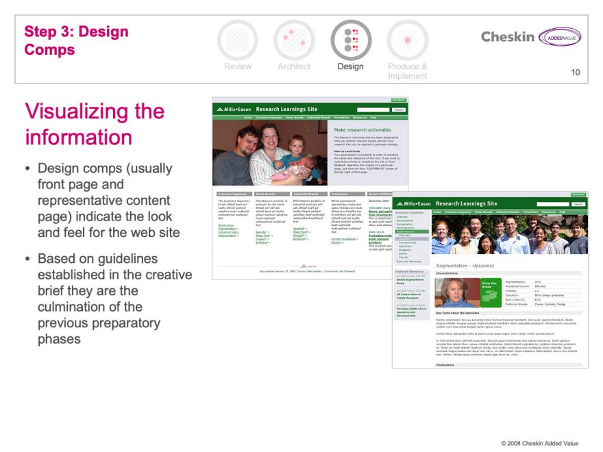
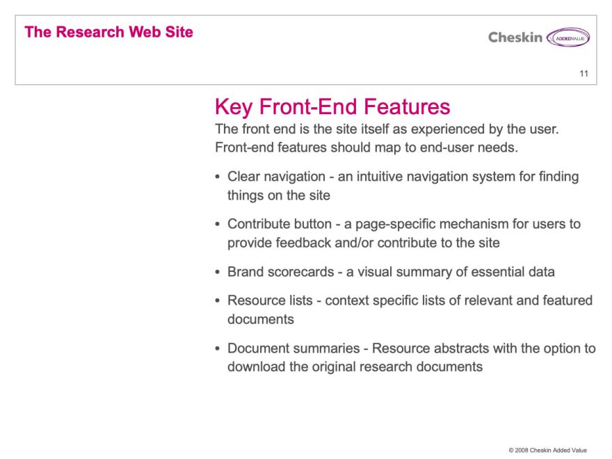
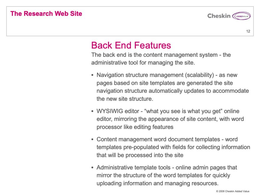
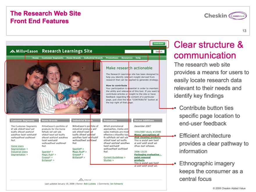
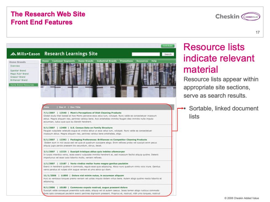
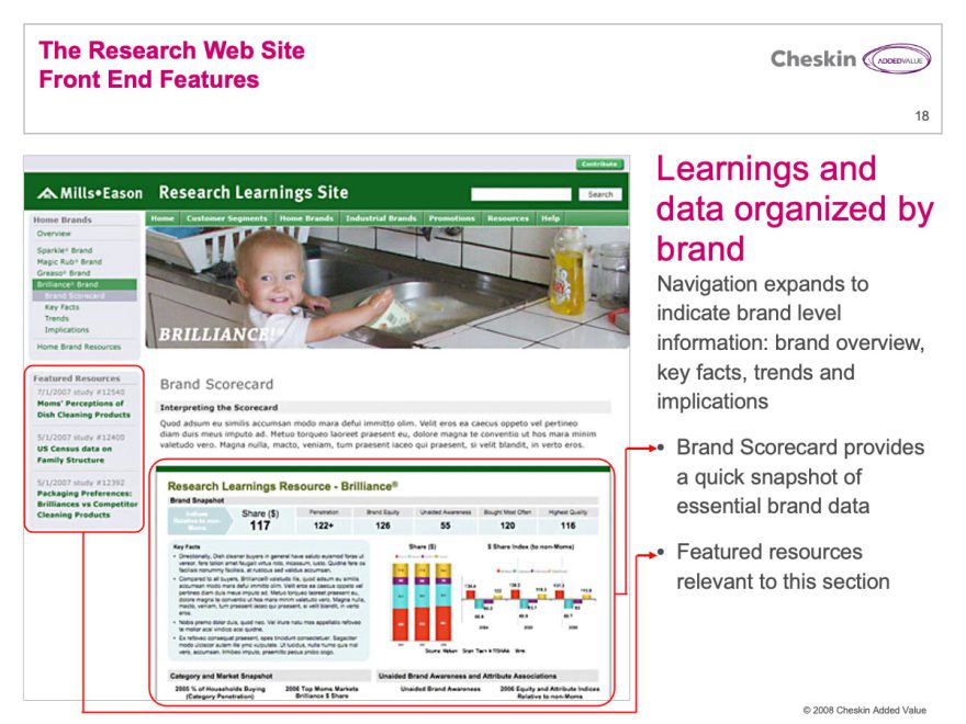
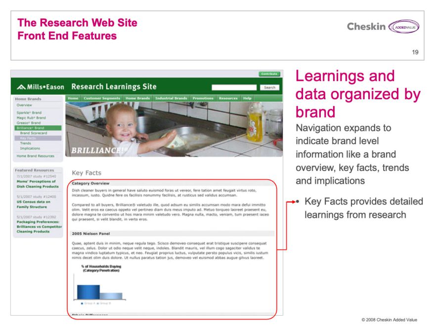
I developed the Market Research Site offering as a solution to this problem. These were information-rich sites that made it easy to find and identify important insight and share information across the company. They began with an overview of a segment or topic and allowed the user to drill down to report abstracts and even the original data itself.
The example on this image is fictional, but representative of the type of work I did. I served as designer, project manager and production artist on these projects, creating everything but the CMS and written content.
These portals were significantly more complicated to develop and featured an integrated, custom CMS solution. I personally led and executed these projects. These scrubbed slides are part of a guide I created explaining the process required to create the sites, the time-frame, effort and costs to add them on to a project.

