Heat.net / Segasoft Design Management
Defining the Community Multi-player Gaming Site
Designing the community-driven multiplayer gaming site
I started at Segasoft (later sega.com) as a contractor, redesigning virtualmakeover.com. Initially all of the company’s web design work was outsourced to costly advertising agencies. When my proposal to put together a team to handle their web needs in-house was accepted, I took over as Art Director for all company web product, including Segasoft.com (the corporate presence) and Heat.net (the pioneering online gaming site).
Unless otherwise indicated, my role on these projects included art direction, design, and all production.
Accomplishments
- Brought the management of Heat.net in-house after years of outsourcing to third party vendors
- Recruited and trained a highly regarded team that continued to support the organization after I left following another company restructuring
- Supported the marketing organization with ingenuous solutions to outlandish problems
- Led the complete redesign of the platform onto the Hybris CMS platform
Implementing design consistency
When I assumed the Art Director position for Segasoft’s Heat.net, the design was outsourced and there were no guidelines insuring consistency. My first efforts were to hire and train a staff to apply design standards to mini-sites and banners being used to promote events on Heat.
I established the guildelines, these minisites were created by Rodwin Pabello and the banners by Graham Shaw.
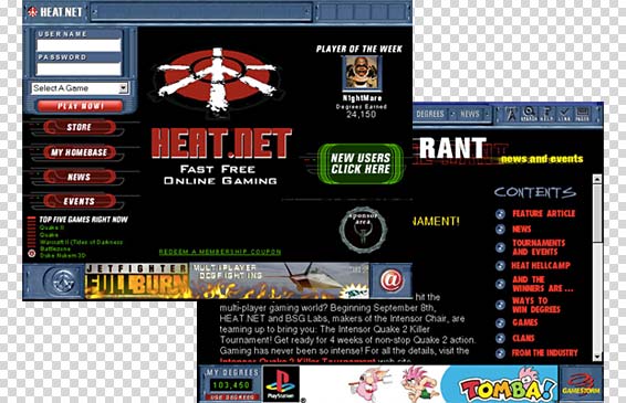
The legacy Heat.net design
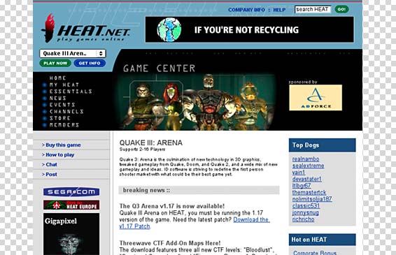
Heat’s original design was clumsy, heavy and out of date. A complex backend, accessible only through a unix shell, made it difficult to enact even the most simple visual changes, like replacing a graphic. All site content was hidden behind a login form and even the registration process was convoluted.
I maintained design consistency through site updates but these are not my designs.
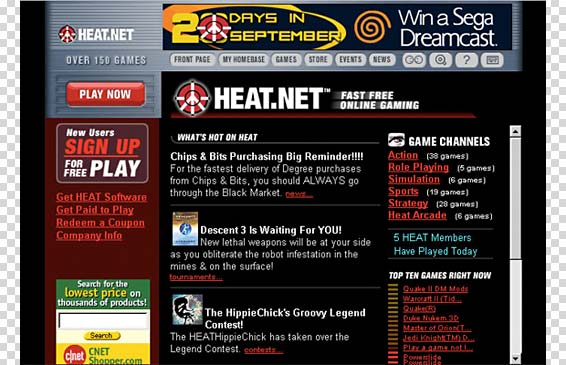
My interim Redesign
I worked closely with marketing and technology groups to develop a progressive roadmap of interim changes leading to a complete site redesign. We began by streamlining the interface and bringing as much content as possible foreword so that login was only required when database access was required.
Complete Heat redesign concept
The eventual site re-launch was a mammoth undertaking that required the coordinated efforts of complete front and backend restructuring, the implementation of an entirely new custom content management system and a content redesign that moved the site from a paid membership model to a content-driven, page-click, ad model. In the process of redesigning the site, we grew content from approximately 150 pages to close to 1000.
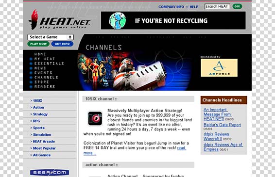
Heat.net redesign – Game Type Channels
We designed the new site to be content-driven with information centered around game channels (games grouped by type).
I made the graphics flat and simple to enhance speedy download.
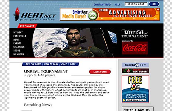
Heat.net redesign – Game Pages
Individual third-party game pages included community driven features, downloads, and relevant editorial and help/faq content.
Users could compete against one another simply by clicking “play now”.
Heat.net gaming applications
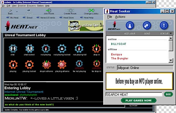
We concurrently redesigned the windows based gaming and social networking applications, the look and feel of which were severely limited by technology requirements of the era.
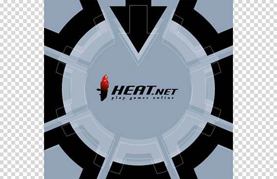
Game launch screen
This screen appeared as gamers left to the lobby to join a live game hosted over the internet.
The overall redesign was a major success in terms of both teamwork and actuating on documented goals and objectives. We hit all targets, including the long advertised launch date.


