Cole-Parmer/Antylia Scientific
Optimizing the Enterprise E-Commerce Redesign
I was the UX and Web Product Manager for Cole-Parmer/Antylia Scientific from August 2015 to November 2023. My primary focus was coleparmer.com and masterflex.com, which together accounted for about $40M in revenue in 2015. When I started, we were Cole-Parmer. In 2021 we rebranded the company as Antylia Scientific.
At the time I came on board, we were a scientific product distributor with a 60-year history. The Cole-Parmer website offered about 100k products and over 800 brands. Products ranged from laboratory consumables to benchtop and capital equipment like freezers and ovens.
My team consisted of two hybrid web designers a merchandiser and myself. Over time I was promoted to Senior Manager and took on responsibility for managing the Paid Search, SEO and Amazon teams. I added a third designer who provided FED competency.
I was responsible for the user experience and all content on the site. My team and I designed, produced and managed all updates (excluding product data and the blog). This included technical articles, brand pages, category pages, homepage updates, marketing campaigns etc. We designed new site features and worked with IT on implementation. We provided the entire tip to tail process from ideation to design, html development, production and QA. I personally served as site manager, defining the roadmap and working with IT to prioritize and implement the backlog. I developed site strategy, tracked KPIs, synthesized analytics and reported out on progress. I was also hands-on lead on key projects, developed pages, produced promotion codes and published all “in prod” edits.
Accomplishments
Complete coleparmer.com and masteflex.com redesign driving $30M growth in 5 years – view details >
- I was brought on board as the team was embarking on a complete re-platform and redesign. We hit all our deadlines and within months of relaunch, the new site was outperforming the old one.
Masterflex sale to Avantor for $2.9 Billion
- Masterflex was our most differentiated product line with a highly lucrative consumables component. We supported the brand with optimized landing pages, guided selling and other marketing initiatives. After years of effective product development and brand marketing, leadership sold the brand to Avantor for a reported $2.9 Billion.
Complete Company Rebrand to Antylia Scientific – For details visit the UX program management page >
Coleparmer.com Post-Launch Experience Enhancements
- Page speed reductions and site optimization – view details >
During the site redesign, our agency partner failed to meet their page speed targets. After Google went to a mobile-first model we started to see a drop in SEO performance. I worked with the SEO lead and IT to build a roadmap of technical SEO projects. We were able to shave about a second and a half off the mobile page speed. This significantly improved our ranking.
- Item detail page marketing modules – view details >
Cross-marketing was not in scope for the redesign. I worked with IT to design and implement a series of marketing components on the IDP allowing us to cross-sell, add banners and promote product systems. We saw a growth in AOV from about $500 to about $700.
Coleparmer.com Post-Launch Experience Enhancements continued
- Guided selling components – view details >
Many of our products and product families were quite complicated, supporting a variety of specific applications (which is hugely important for regulated companies). We implemented a variety of interactive means for helping customers identify specific solutions.
- Item prioritization – our search tool did not support machine learning.
We developed a homegrown tool for prioritizing key products in our browse and search results.
- Online returns and other self-service projects – With small teams, customer self-service was a major focus for the organization. Providing self-service tools helped us reduce the call-in load to customer service. UX developed returns and guided selling to support this initiative.
Continuous optimization and content – For details visit the UX program management page >
Implementing process and establishing UX – For details visit the UX program management page >
New site launches and Internal Consulting – For details visit the UX program management page >
The Coleparmer.com Redesign
When I joined Cole-Parmer, a re-platforming and redesign project was underway with a third-party agency. The discovery phase was complete and the team was about to begin designing a new website. I quickly got up to speed on the company structure and core product offering. I met with representatives from various areas of the business, reviewed existing personas and listened to customer calls.
We were moving from a proprietary content management system to a hybrid Insite/Oracle Endeca solution. This was an IT driven project so the scope for experience improvements was limited.
THE CHALLENGE
The site was clunky and outdated, built on a very limited propriety platform. Updates were time consuming, required technical expertise and marketing features were limited. Project was led by IT and focused on technical enhancements.
SCOPE AND OBJECTIVES
- Move the site onto a new PIM, CMS and Search Platform
- Upgrade the look and feel but maintain the existing branding
- Develop a responsive mobile experience
- Introduce a parent/child product structure
- Full google analytics implementation and SEO best practices
- Launch free-standing, localized versions in the US, Canada, China, Germany, India, the UK and for Masterflex.com
- Translate the complete interface and thousands of products into Chinese and German
- Improve the features for marketing and develop a promotions engine
- Rework the site taxonomy
- Provide more content opportunities
ROLES
- We worked with a third-party agency on the redesign and replatforming
- I was UX lead on the client side, as well as hands-on design and production
- Laura Santucci and Ryan Sherwood were co-leads on this project.
TOOLS
- PIM: InRiver
- CMS (static content): Insite
- CMS (dynamic content) and search: Endeca
- DESIGN: Invision, Sketch, Adobe Creative Suite, Word, Excel
Discovery
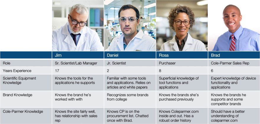
Discovery began before I came onboard. The functional/IT scope for the project had been defined. User personas had been developed based on research with internal SMEs. The site experience scope was limited to supporting existing features from the previous experience and any out of the box features offered by the new platform. We had some scope to address best practice concerns.
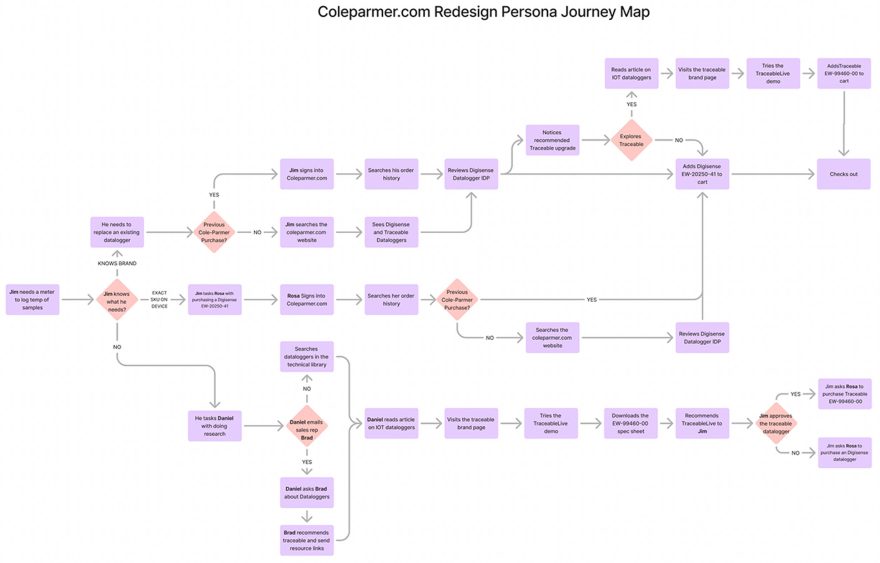
I created a journey map based on the personas to help validate that scope and identify any necessary scope additions and backlog features we’d want to address in future projects
Design
Design began immediately. We broke the site up into sections and worked iteratively through each. I and my team created requirements for each section, based on learnings from discovery and the previous site.
We reviewed and provided feedback on the agency’s designs. Once the general design and sitemaps were finalized, my team and I created comps for remaining sections. Basic usability testing was handled in-house with product managers and customer service agents as proxies.
Development
As we finalized the overall template structure and section designs, IT been building out the templates in the new CMS. We ported over as much content as possible but I and my team had to rebuild a almost all static content.
Once the US site content was complete, we began the translation process. While some content could be translated through spreadsheets the bulk of the material had to be input blindly by my team and I (none of us spoke German or Chinese). Our global teams reviewed implementation.
We copied site content across all our domains (.ca, .com.cn, .de, etc) and tested thoroughly with as many internal personnel as possible.
After some protracted IT troubleshooting, we were able to launch the new coleparmer.com in December of 2016.
Results of the Redesign
The Cole-Parmer redesign was a major success. Our migration strategy was sound and we had few complaints from customers. There was a brief dip in organic performance, as was to be expected, but we completely rebounded and were seeing year over year gains in less than three months.
In the first year, we saw revenue growth of 15%. Within five years we had grown revenue from $38M to $71M on coleparmer.com alone.
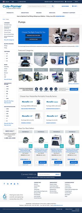
Redesigned Category Drilldown with Supplemental Content and Cross-Marketing Components
Site improvements at launch
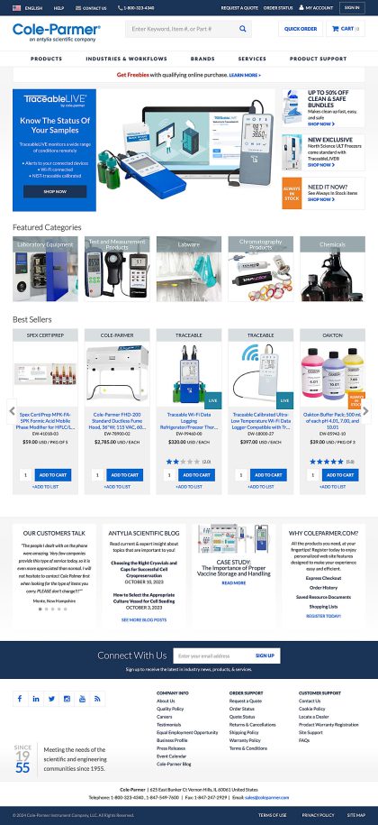
- Improved look and feel
- UX and SEO best practice implementation
- Fully mobile-responsive
- Seven site variants: US/Domestic, Canada, China, Germany, India, UK, Masterflex
- Three languages: English, Chinese and German. We later introduced a French site and French translation
- Introduced parent/child relationship for products. Like items were grouped under a common parent, reducing sprawl in search.
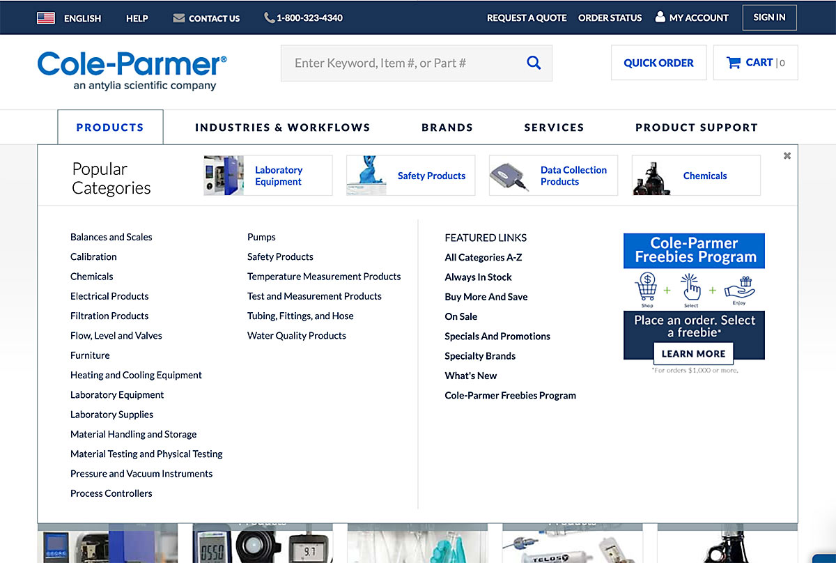
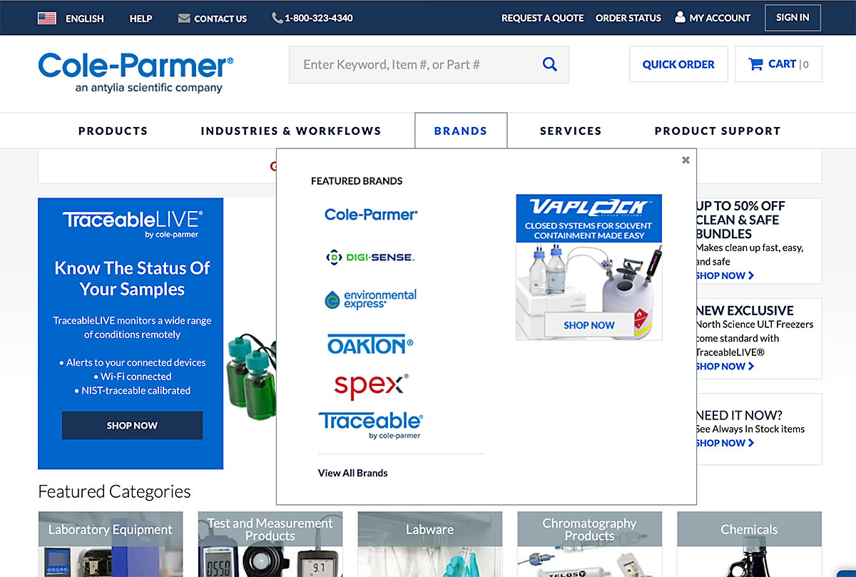
- Standardized product taxonomy and new mega menus
- Account lists and order history
- An improved CMS platform
- Robust promotions engine
Site Optimization and Growth
Launching the new site was a major accomplishment, but that alone was not our measure of success. As was expected, we experienced a short-term drop in some KPIs. We added an SEO specialist to my team and I worked with her to to develop a plan to improve our technical metrics and SEO performance. Within three months we had resolved some of our key issues and began outperforming the previous site.
I developed a roadmap for the site experience and entered a backlog of design and IT tickets into our ticketing system. I prioritized this backlog based on what was most important to the business and the customer. Bugs in production that affected the customer experience were, of course, highest priority. Asks from leadership followed, initiatives that would drive transactions and revenue, projects that would improve KPIs leveling up to revenue and those that aligned with our broader company goals. I developed a weighted algorithm based on this prioritization.
Pagespeed and Technical SEO
As the redesign project failed to hit technical goals for performance, we followed the launch up with an immediate optimization project. We worked with our agency to develop a prioritized list of technical improvements we thought would help us improve pagespeed and hit Google’s key metrics. We developed functionality that would allow us to hide some elements from our mobile experience. Page speed improved about 1.5 secs as did our organic traffic.
Once we addressed the major issues we shifted our focus to adding more marketing functionality.
Site Enhancement: Item Detail Page Marketing Zones
The item and product pages for the new site were dynamically generated from data in the PIM, making it possible for non-technical employees to contribute to the site. However this was limited to item specifications and did not support custom marketing. The business wanted to be able to cross-sell related products and upsell new and advanced products.
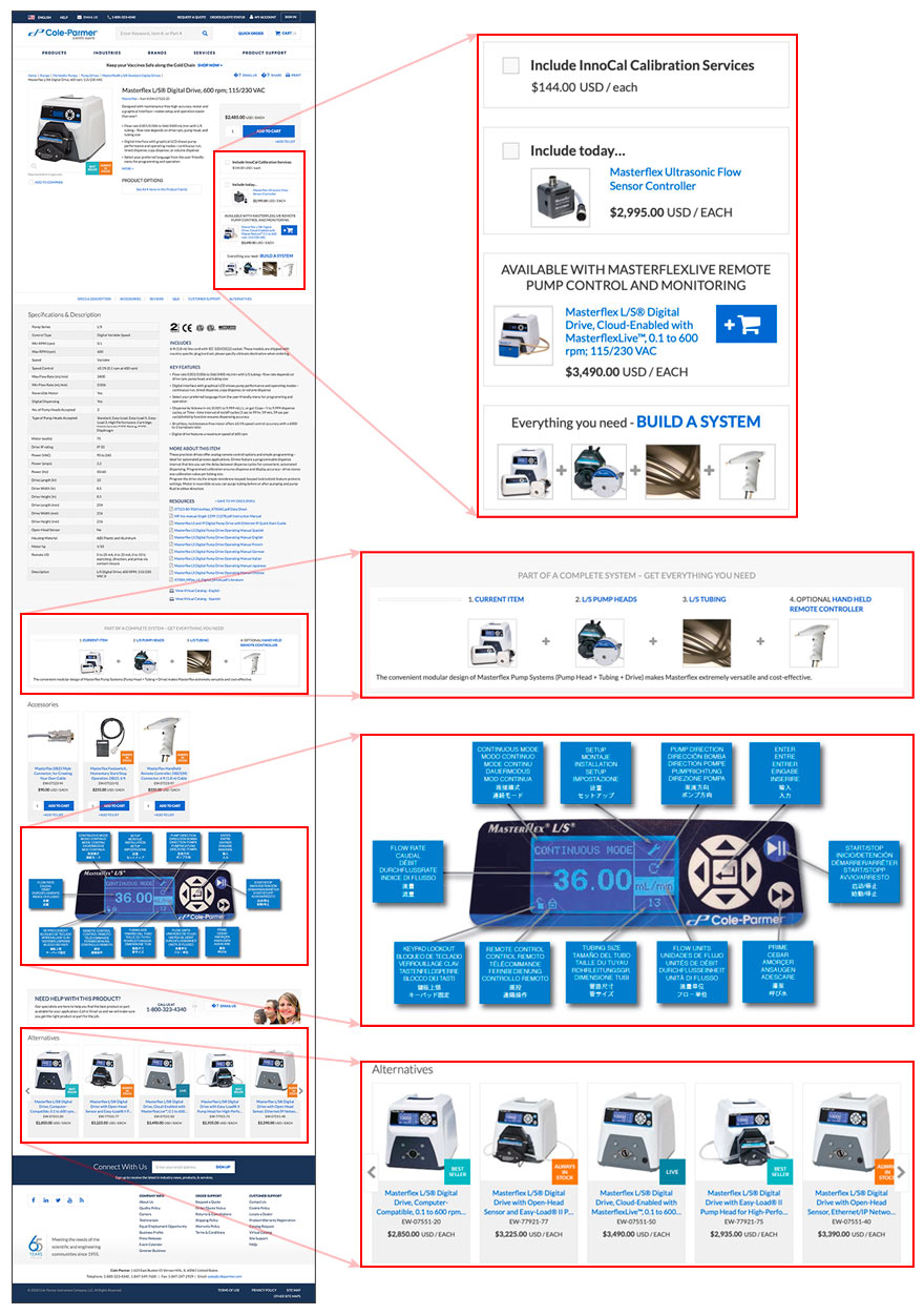
One of the first things we did on the new site was a followup project to introduce marketing modules like cross-sells, alternate products and banners onto individual item pages (IDPs).
Within a few months we added multiple marketing zones to the item pages. We analyzed data to determine which items were most often bought with other items and cross-marketed those on appropriate pages. We saw a jump in AOV and transactions.
THE CHALLENGE
We were unable to add marketing messages and banners to the item detail pages except for in product copy.
MY ROLE
- Project lead, scope and direction
- Specifications
THE TEAM
- Laura Santucci and Ryan Sherwood were UXAs on the project
- Max Nadjari and the IT team worked with a third party vendor on development
- The entire team helped with UAT
Site Enhancement: Guided Selling Modules
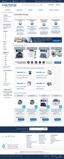
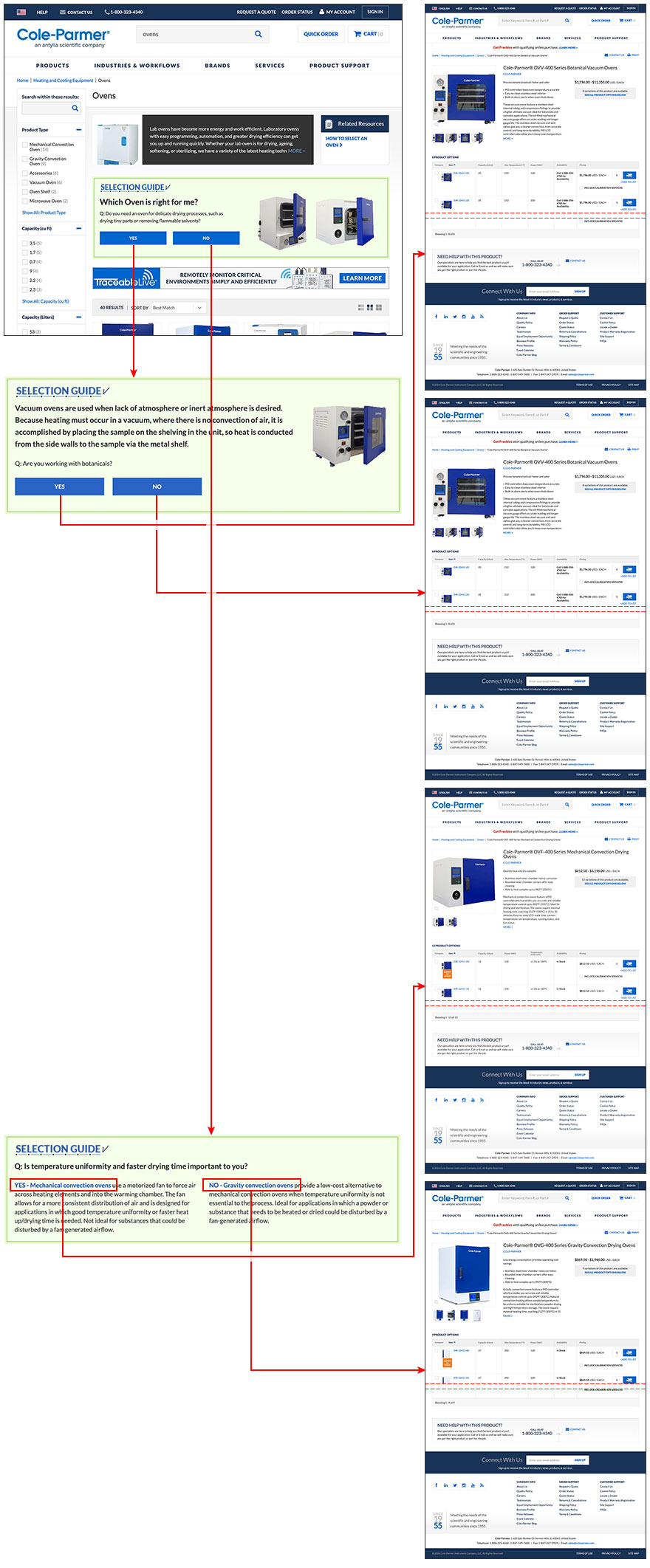
Many of the products that Cole-Parmer sells are quite complicated with very specific scientific applications. We continuously developed tools to help customers self-service and reduce the load on customer support. One important area of exploration for us was guided selling, helping customers narrow their product options by answering simple questions. We experimented with very complex tools that produced elegant results but the development time was too long. I envisioned a very simple tool that could be easily built in HTML for categories with shallow decision trees. The result was our proprietary selection guides that we were able to develop quickly and implement throughout the site.
The customer answers a series of simple question, eventually leading to a subcategory, product or specific item.
THE CHALLENGE
We wanted to create a simple guided selling module that would help customers narrow their product assortment quickly, based on natural language interactions, and that would be easy to develop and roll out quickly on many of our leading product categories.
MY ROLE
- Project lead, scope and direction
- I defined the concept
THE TEAM
- Bryan Caselli was lead UX and FED on the proof of concept.
- He worked with representatives of the product management team to define the decision tree.

