WW Grainger UX Management
Role and Responsibilities
I worked on the User Experience team for Grainger during a pivotal time in the organization, as they looked to drive more and more of their business online. I started as a Senior User Experience designer when the entire team was four designers. Millions of dollars were already flowing through the site. One of my first assignments was to develop a very simple mobile experience to get the site up and running on handhelds.
Grainger brought in new digital leadership and tasked them with driving more transactions online. Our first major project was a complete redesign of the primary website. I served as Senior Designer on that project, focusing my efforts on the my account section where I developed tools for our users to manage their multi-user accounts.
Once the redesign was underway, I was promoted to User Experience manager and tasked with managing a team focused on continuous optimization and improvement of the Account Management section of the website.
Within months the User Experience team had grown to over 70 members. We implemented one of the most robust User Experience teams in B2B with dedicated UX, Fed, Research, and management teams. Our research team set up a customer panel that was irreplaceable for user-testing our designs.
Accomplishments
Being part of a world class UX team was an inspiring experience. Our designs benefitted from a rigorous review and testing process. I was especially proud of the account management team, which consistently delivered world-class solutions.
Designed the pilot for Grainger’s first mobile site – view details >
- I was brought onboard as a contract UXA. My first assignment was to develop wireframes and comps for a Grainger.com mobile experience.
Supported complete redesign of Grainger.com – view details >
- As new leadership took over, I was hired full-time as a Senior UXA to support a full site redesign. I worked with two contractors on wireframes the My Account section of the website. Shortly into the project I was promoted to manager and asked to manage that section of the experience. We were already doing $9M a day on the site. Within a few years that had grown to $11M and then $13.
Led the design of the Patent Award Winning Order Management Workflow System – view details >
- I led the design of this killer app that allowed our customers to manage spend on their accounts. The tool allowed them to setup submitter-approver workflow chains (multi-levels deep if desired) and a final review stage so every order could be monitored. It also supported locking users to shipping locations and payment methods. The functionality drove over 20% revenue increases on accounts that activated the system.
- Patent awarded for “Systems and methods for administering customer purchasing processes” (order management system designed while at Grainger)
Developed a solution for guided selling functionality – view details >
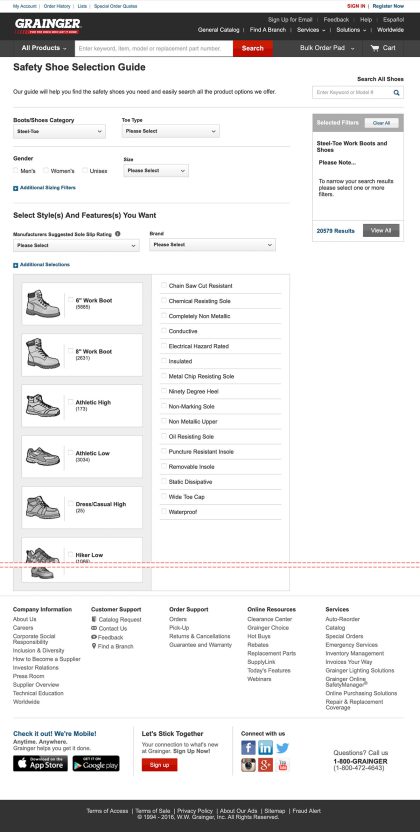
- Grainger was known for its motor match tool that allowed customers to identify a specific product by answering a set of questions. That tool had higher conversion than search/browse but took a long time to develop. I led an effort to develop similar tools with a more nimble technical foundation that took weeks, not months to develop. We created a shoe finder and a lighting finder.
Led design of the UX team’s knowledge center
- We gathered learnings and metrics in every project we worked on. But it was difficult to share that material. I led a team that developed a solution in Confluence in which we could log all our projects, learnings and reports generated. The material was organized and tagged so anyone in the discovery phase of a project could access relevant insights without repeating what had already been done.
Redefining the target audience for My Account
Defining an opportunity
Grainger is a huge international company. There was a massive E-commerce backlog and initially the team was small. It was important to identify the most important projects to prioritize and activate. We worked with the research and analytics teams to make sure we were focused on the most appropriate projects for growth.
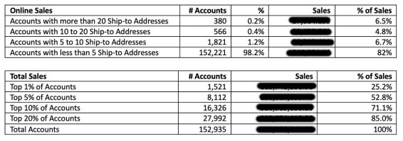
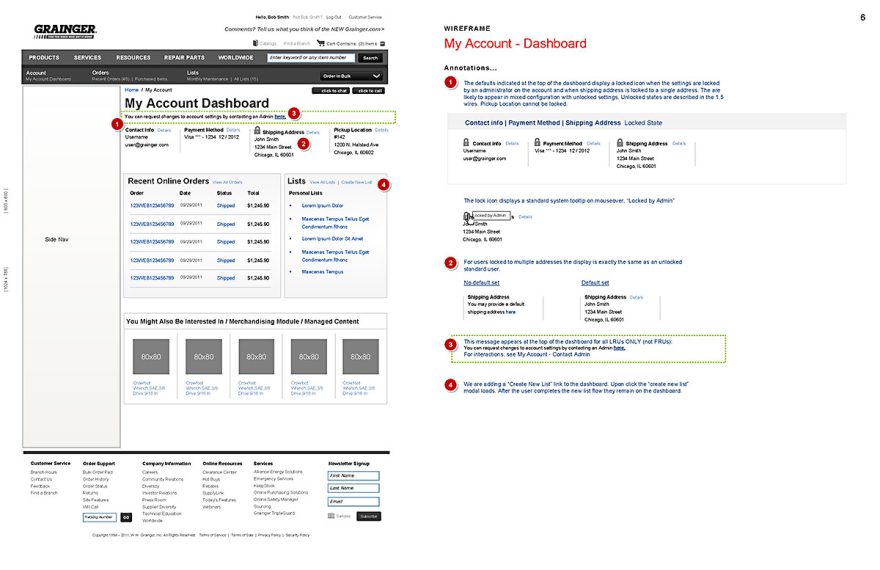
One major insight I had was to help redefine our target customer for My Account. We had adopted an 80/20 approach of focusing on the things that drove the most impact on the most people. So we were given direction to optimize for the average customer, who had 1 user and 1-2 addresses on account. I did some research that showed that almost 20% of online sales was coming from customers with more than 5 addresses on account and 80% of our overall revenue was coming from the top 20% of companies. There was massive room for growth with these customers online. Most were very large organizations with dozens if not hundreds of users on the same account. We couldn’t treat their experience as an exception.
While good UX design always scales with the customer, an optimized experience for 1-2 addresses vs 100 could be very different. We were in danger of short-changing our best customers. This simple insight let to big changes in how we approached the My Account section. We continued to focus on simplicity for the long-tail user but made sure the tools supported the needs we were seeing with our largest customers as well.
My Account Governance and Optimization
The account section of grainger.com was hugely important to the organization. Many of our biggest and best customers were transacting online and needed robust tools to make the experience fast and easy.
We went direct to the customer, gathering feedback through surveys and our Helpdesk to identify pain points we needed to address. Over the years that I managed UX, we systematically improved my account experience. We addressed all known user issues and constantly improved the experience. E- commerce grew from around 20% of total sales to nearly 50%.
MY ROLE
- Art direction, coaching and feedback
- Hands-on Wireframing
- Stakeholder management
- Coordination
DELIVERABLES
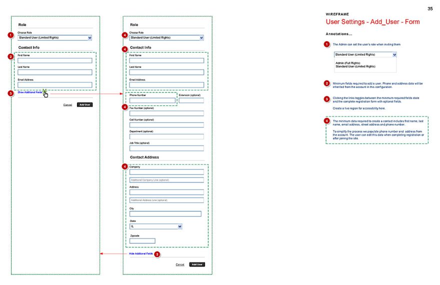
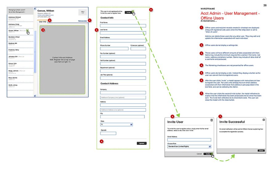
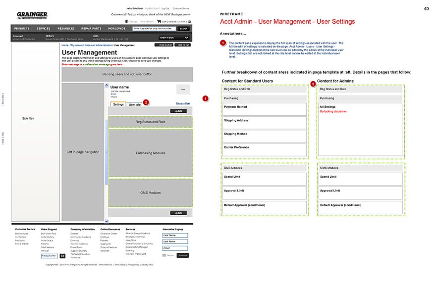
- Complete evolving wireframes defining the My Account experience
- Team members including myself, Mehmet Aygar, Ezio Magarotto, Patryck Ploszaj and others contributed to the design
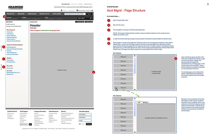
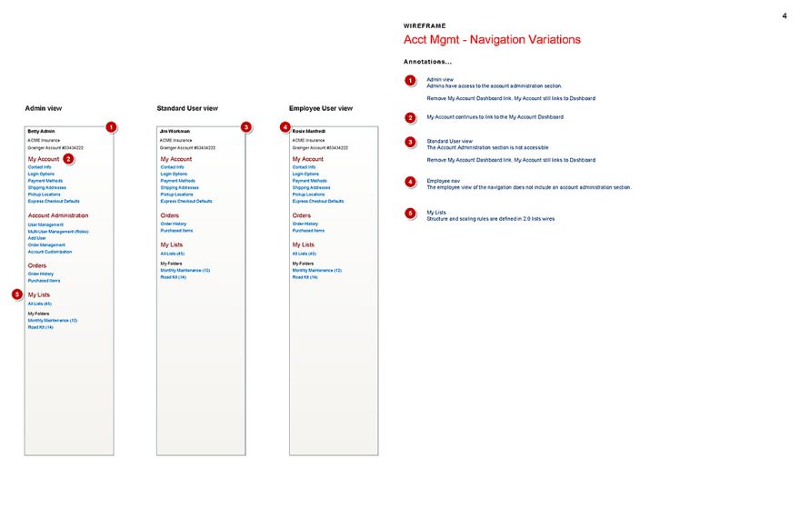
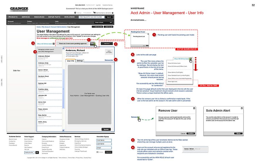
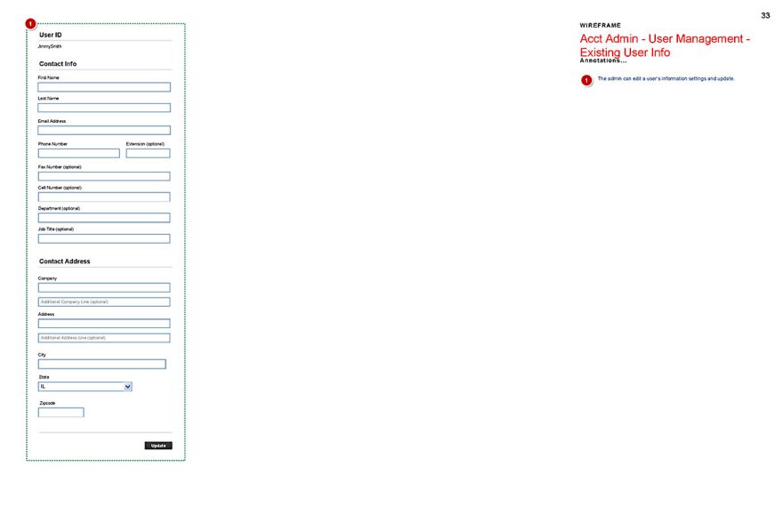
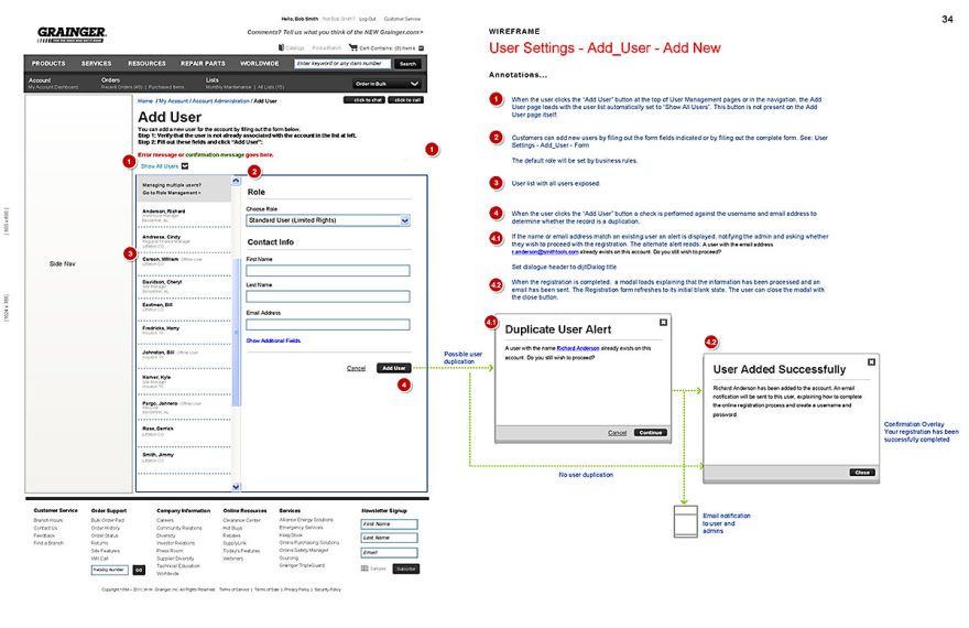
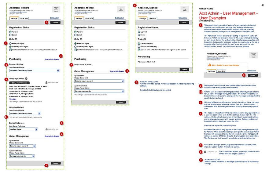
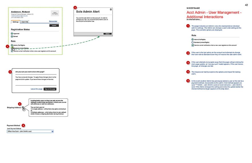
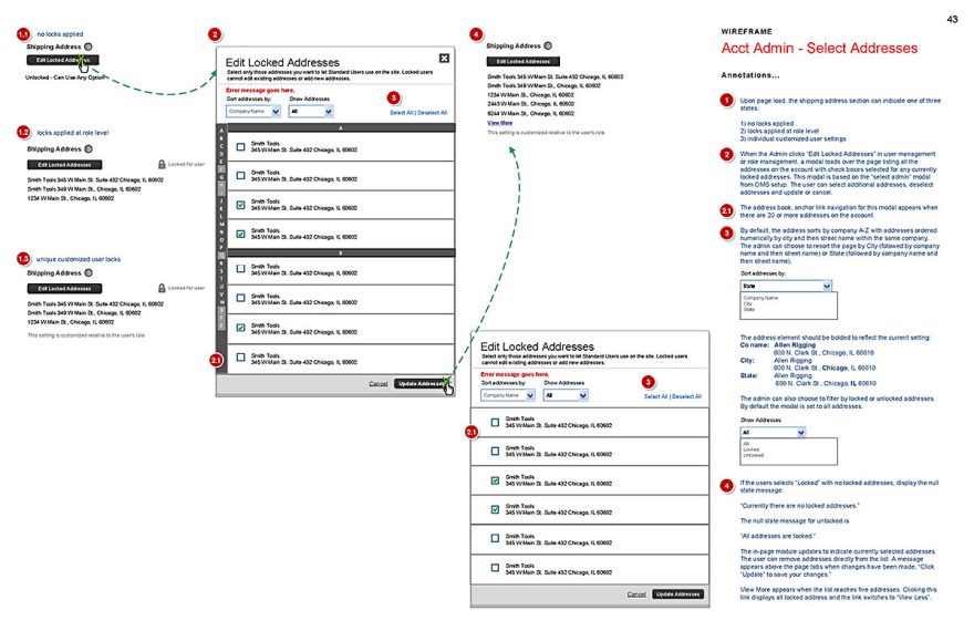
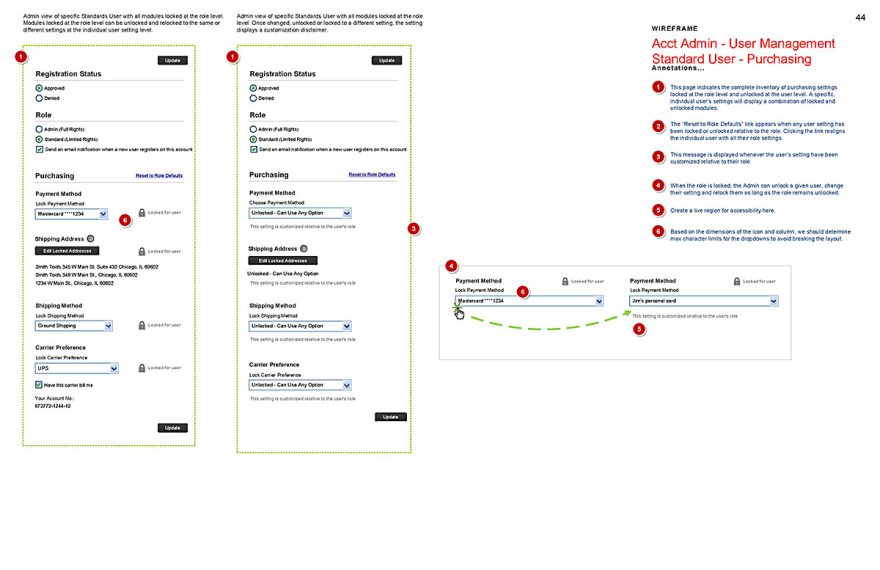
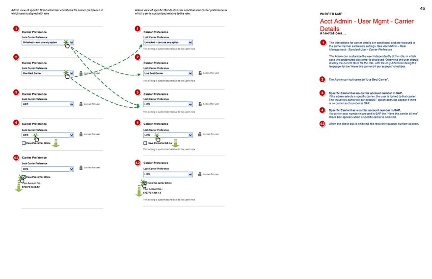
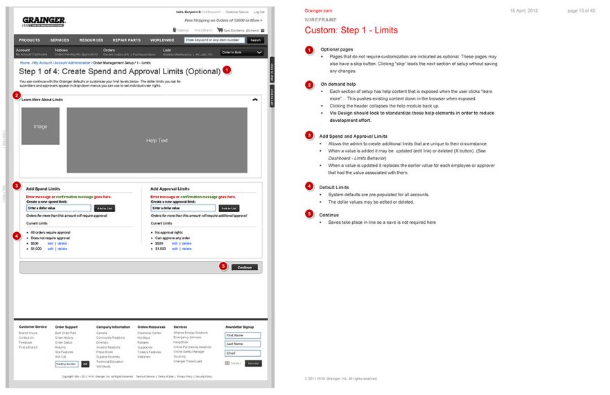
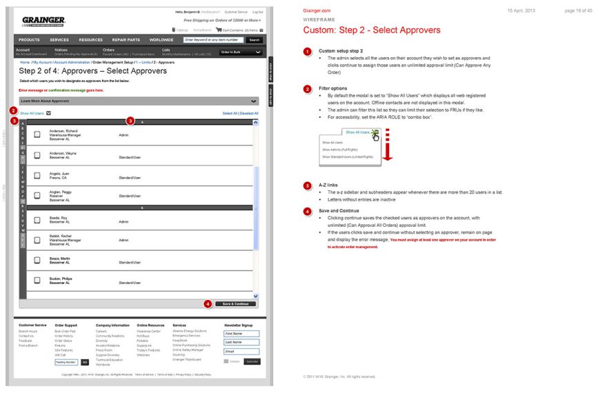
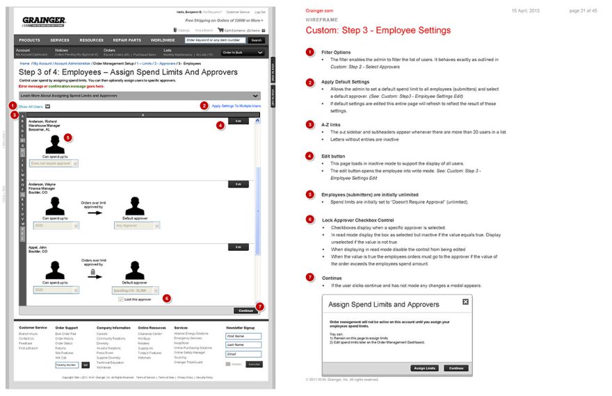
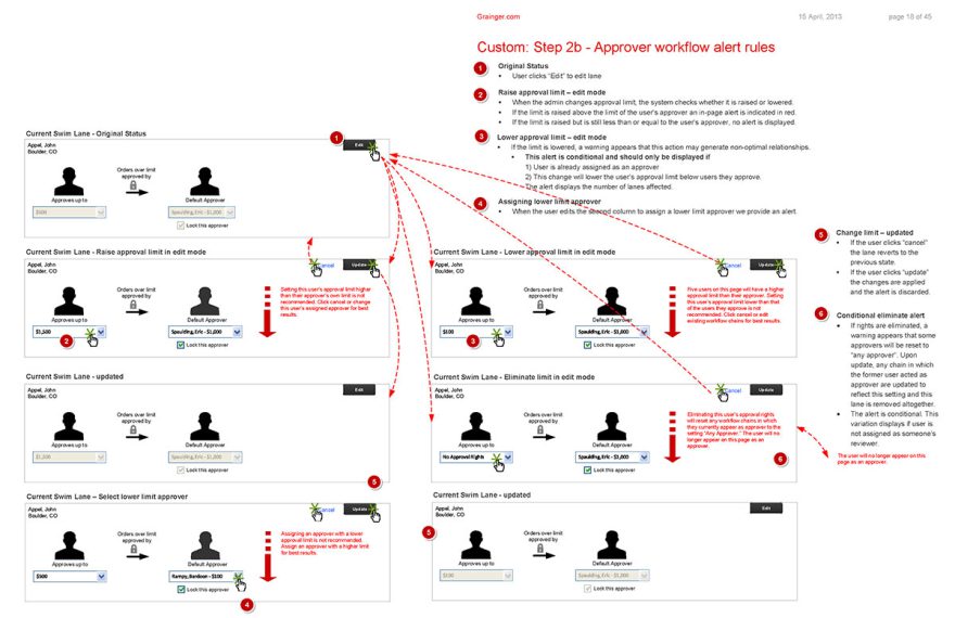
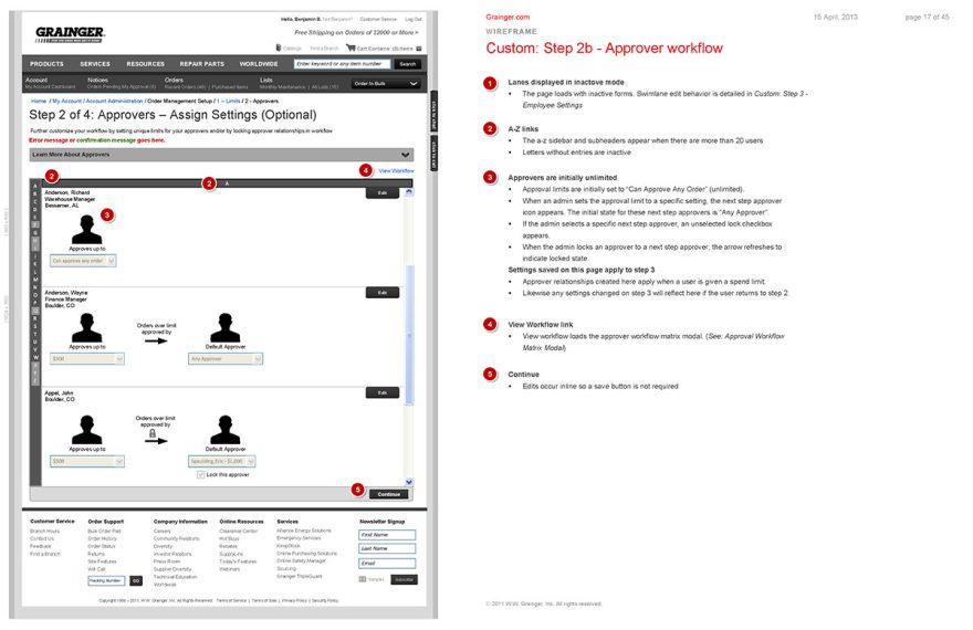
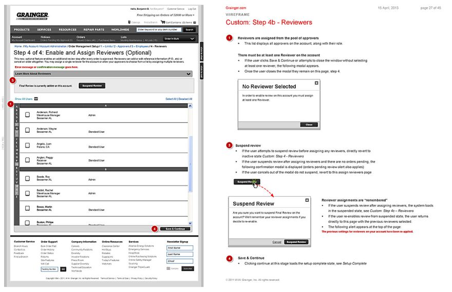
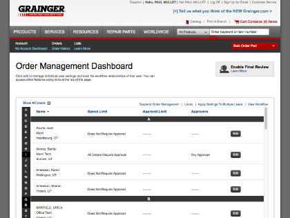
Selected Wireframes for the My Account Administration Experience.
World Class Order Management
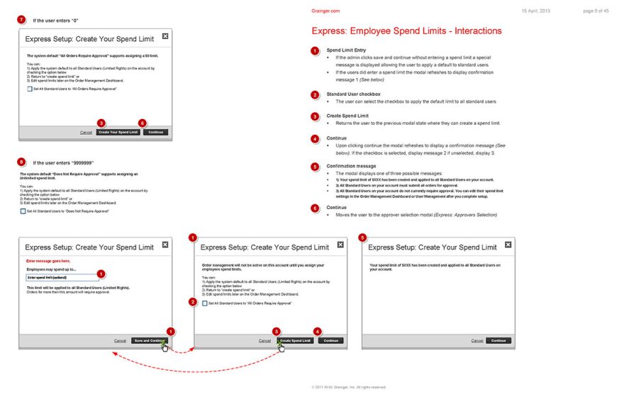
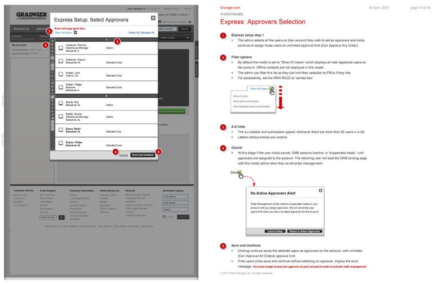
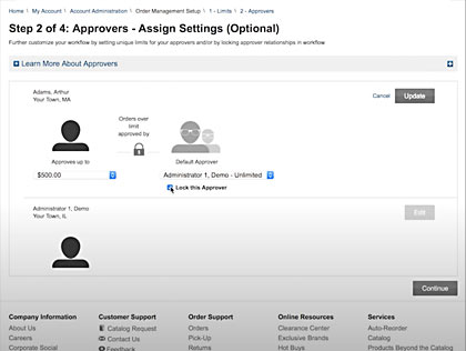
Customer research helped us to identify a gap in the user experience for larger customers. They needed to manage the spend of team members and leverage some kind of order approval system. I worked with my team to develop concepts for an Order Management system that would allow customers to identify an admin on an account who could set spend limit and approval levels and define approval workflows for their team members. For example they might allow a team member to spend up to $500 without approval, but anything over that would require sign-off by a specific approver.
The interactions were complicated but we managed to devise a setup wizard experience that helped the average customer get up and running in a couple clicks. The system also scaled in complexity for those with more advanced needs. Our design earned a patent for order management. In the years since I left I have heard that it is still a highly valued feature on the site. Here’s a YouTube video overview of the offering
MY ROLE
- Project evolved from the roles structure I helped define for account management.
- Initial concept ideation and hands on wireframes
- Art direction, coaching and feedback
DELIVERABLES
- I set the context and suggested the concept
- Team members including Mehmet Aygar, Ezio Magarotto, Chris Munoz, Josh Reichlin and others worked on the experience
The OMS Project Process
Initial state
- The Order Management System (OMS) we developed was completely new.
- Underlying My Account functionality that supported OMS was already in place from previous projects.
Discovery
- We had planned discovery research with customers to inform the requirements. Unfortunately, we were unable to field enough customers for a robust study. We worked with internal SMEs as a proxy.
- My team and I did competitive research within the industry and of leading influential sites. Much of the order management functionality is difficult to study without a history of ordering against the account. We reviewed training videos and guides.
- BSAs had gathered input from customers on their biggest needs and pain points and identified core requirements.
Design and Testing
- My UX team and I developed rough, blue-sky concepts, based on what we knew of the personas and the insights from our BSAs. We were able to test these concepts directly with customers. We revised our designs based on customer feedback and research observations.
- We built out a prototype which we tested with customers again. After another round of revisions, we began development.
Development
- BSAs created the user stories, and we developed the functionality over a series of agile sprints. Once the functionality was in a testing environment we again tested thoroughly with customers for usability. We made revisions in test, ran thorough QA and then went live with the experience.
OMS Journey Maps
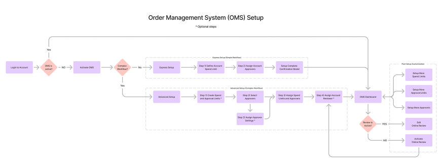
OMS Setup
The customer experience could be broken into two general process maps. First was OMS setup. That’s the process of activating OMS on the account and going through express or advanced setup.
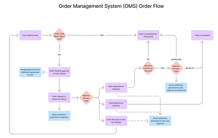
OMS Order Flow
Once OMS is active approvals, rejections and potential final review is active on account. They OMS order flow map indicates how orders flow through these workflows.
OMS Wireframes
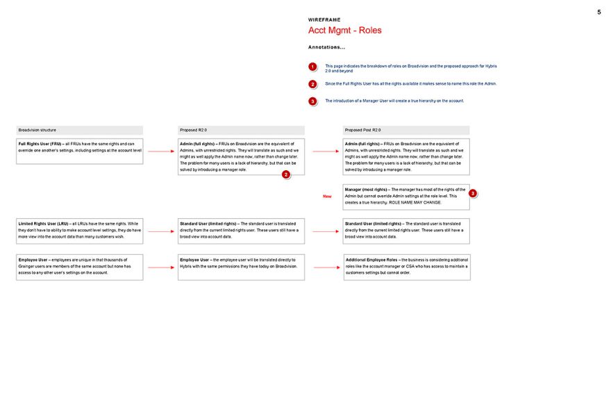
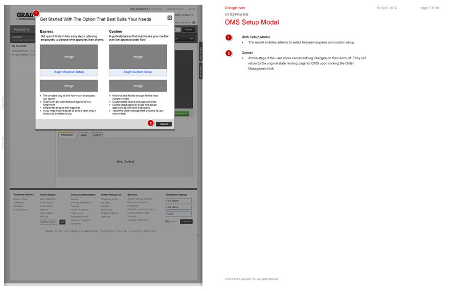
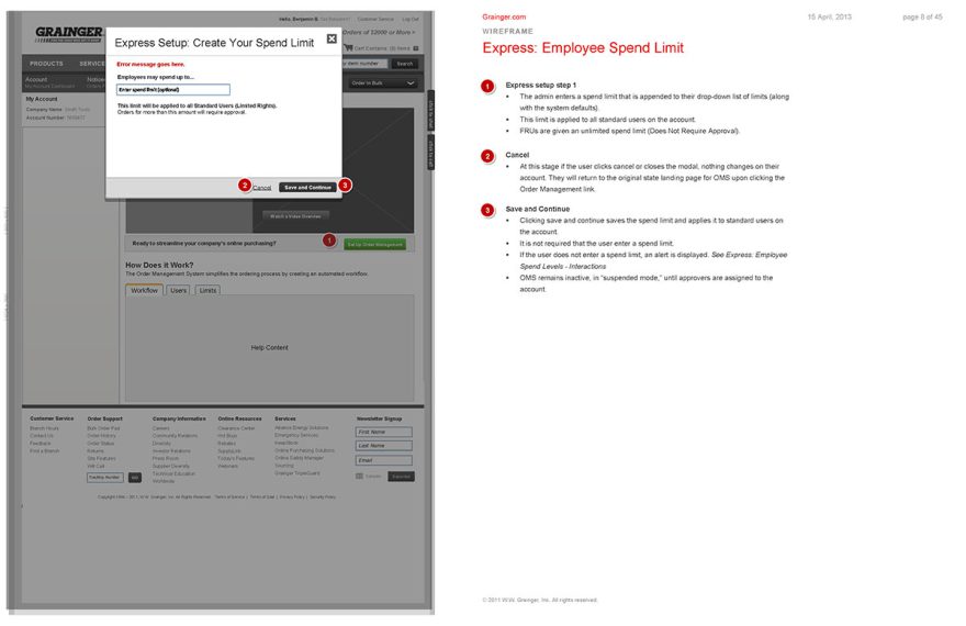
The wireframe process for the OMS experience was a best practices process. We began by defining the role structure for the account section of the website. Our larger customers wanted to control employee behavior and spend on the site. In some cases they wanted to lock their employees to certain subsections of the catalog or shipping addresses. We defined that structure for the accounts.
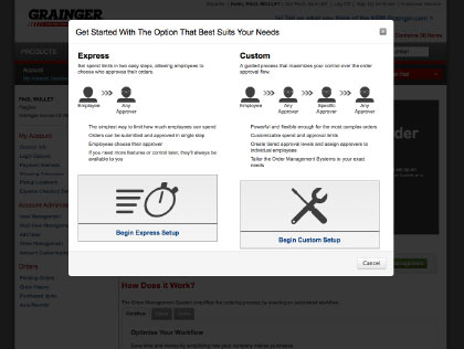
Other customers wanted to control or limit spend. In some cases they wanted employees with authority to approve orders. We defined the general approach and then went through a series of internal revisions, improving the process. Eventually we tested these experiences with customers and refined our designs based on feedback. Finally we developed an expedited method of setup that could serve the 80% of our customers in just a few simple steps, with a more elaborate experience available for those who wanted to further customize. The full scope of functionality could cover about any scenario imaginable. But it could also be setup in minute for the majority of our customers with basic needs. This design quickly gained approval internally with leadership and with our customers in the field.
OMS Comps
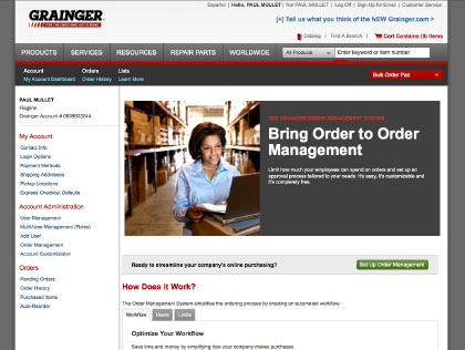
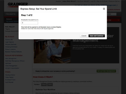
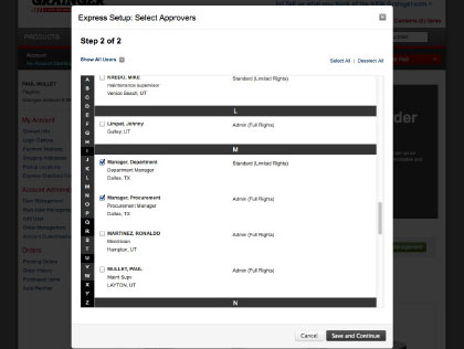
These comps represent much of the self-service setup for customers which required only two steps in express mode.
Guided Selling Tools – Shoe Finder
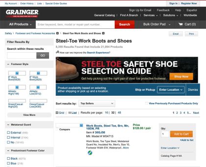
The Grainger catalog featured hundreds of thousands of products. While our search was good, we were always looking to provide tools to help customers better identify the products suited to their needs. Our motor match product allowed customers to narrow the options down by answering a few vital questions. This tool had high conversion but was developed over a long period of time by a third party org. We needed a simpler tool that we could develop easily for key product lines. My team was tasked with building a simple shoe finder tool simply by repurposing the search engine facets.
Conversion for this tool outperformed general search and we were soon developing similar experiences for other products.
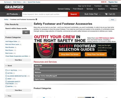
The customer answers a series of simple questions eventually leading to a subcategory, product or specific item.
MY ROLE
- Art direction, coaching and feedback
DELIVERABLES
- I set the context and suggested the concept
- Team members including Johann Flores and Yaddy Arroyo worked on the design
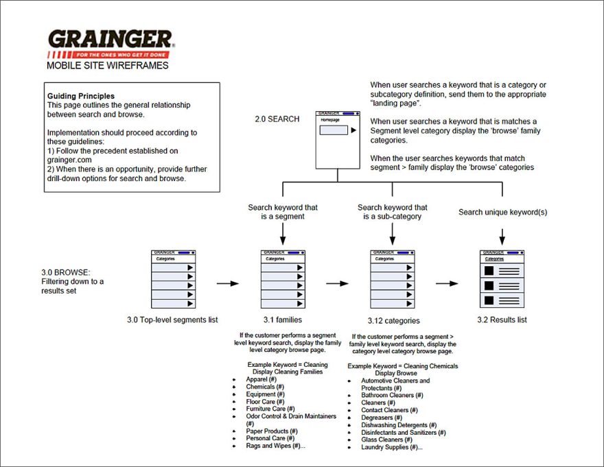
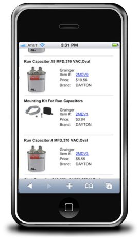
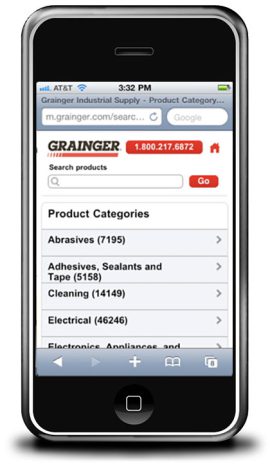
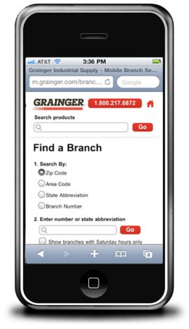
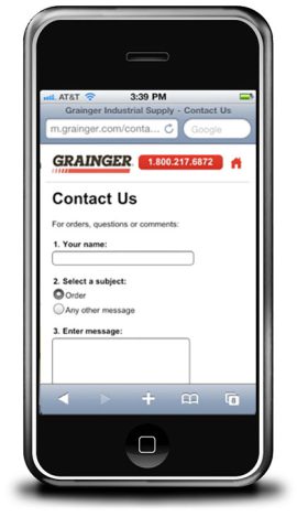
Grainger.com Mobile Pilot
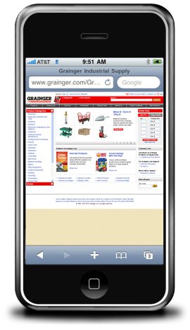
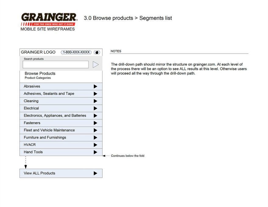
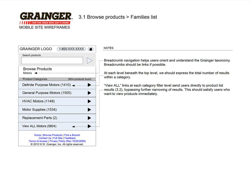
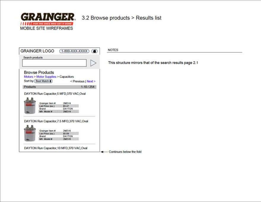
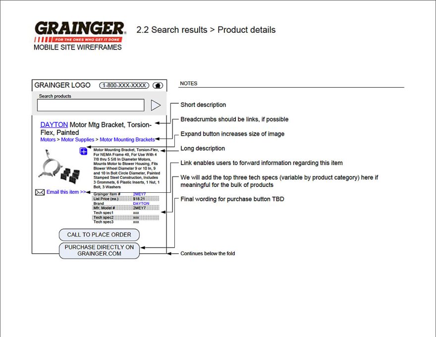
I was brought onto the UX team at Grainger as a contractor when it was a team of four. I was tasked with developing a quick pilot for a mobile site experience.
Mobile E-commerce was just picking up steam when I worked on the pilot. This was of particular importance to our user base many of whom were contractors on the go, with urgent needs for tools and supplies.
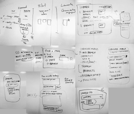
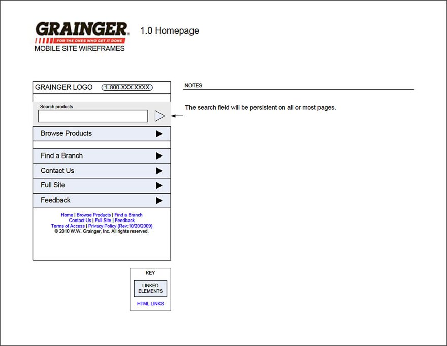
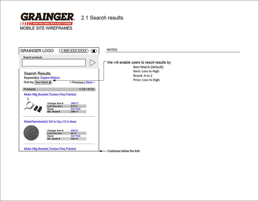
While the scope was very limited, time to market was imperative as we planned to build out a more robust experience during the overall site redesign. I researched UX best practices for mobile, learned what I could about how we expected customers to leverage the interim experience and developed a set of wires that were quickly approved and implemented.
MY ROLE
- Rosie Manfredi and Sophia Drivalas were leads and stakeholders on the project.
- I was lead UXA and Designer. I created wireframes and comps.
- Grainger IT applied the design to the website.
DELIVERABLES
- Complete wireframes for the limited mobile experience.
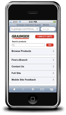
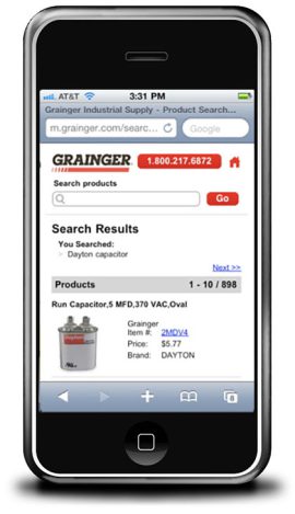
- Comps for the mobile experience.
Select Wireframes for the My Account Administration Experience.
Transforming the organization
As the UX team grew so did the profile of digital within Grainger. We continuously hit new milestones, from $9 Million days to $10M, $11M, $12M and $13M. A greater and greater percentage of transactions for the organization began to take place online. Grainger was a pioneer in digital E-commerce and it was a pleasure to help deliver quality experiences for their customers

